Off Season Is No Reason To Give Up On Flowers

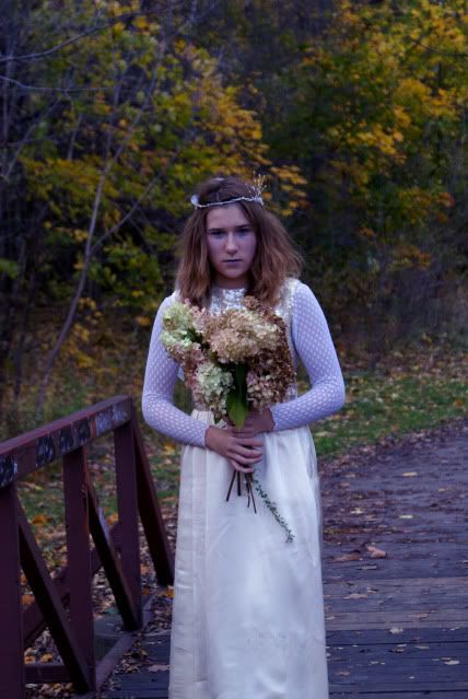
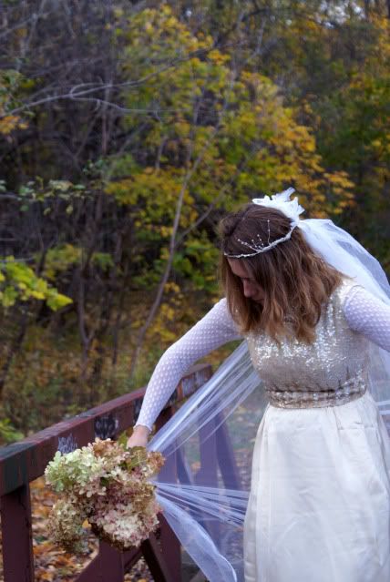
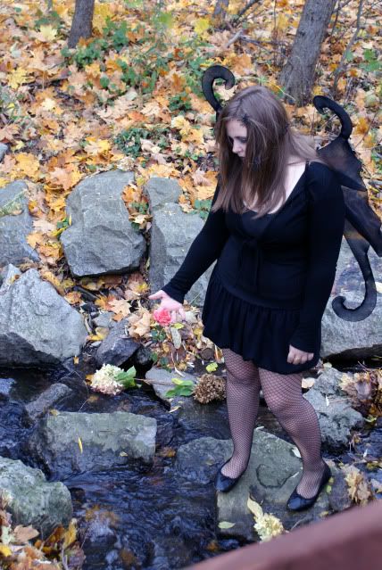
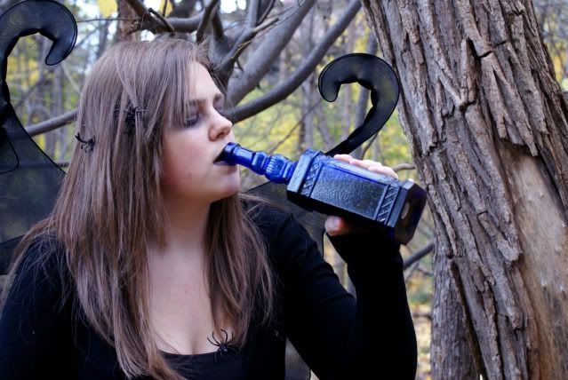
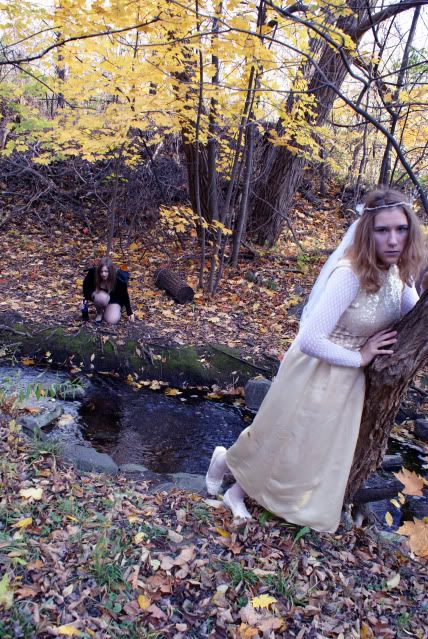
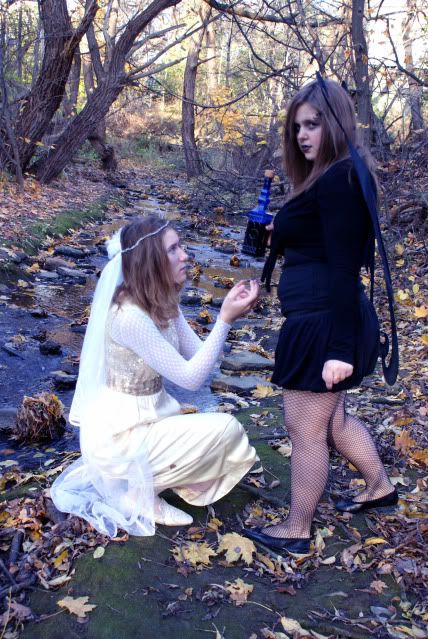
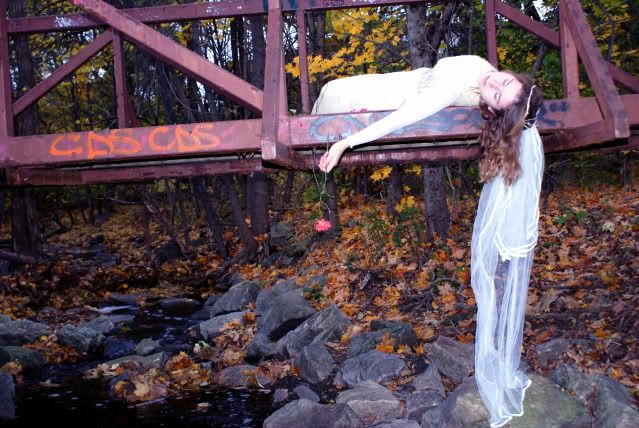
Some things are seasonal and some things can be year round opportunities. It's a wee bit tough to get good (or any) baseball shots at this time of the year. There's probably not a whole lot going on down at the old swimming hole either. Unless you're a lot further south than Connecticut there's not many leaves left of the trees to get lush shots of long vistas. That doesn't mean you have to give up on all the things you think of when you get that summer sort of feeling. Flowers are a good example of something that can be shot all year round. Rather than a walk out in the back yard, you might need a trip down to your local florist. There are good points to needing to buy flowers and bad points. The primary bad point is that summer flowers are free, winter flowers aren't. On the other hand, you get to select flowers at the flower shop and reject any that don't meet with your "standards". The florist has some level of control over what he/she gets in, so you have a minimum level of beauty to start with. Damaged flowers just are not accepted by the florist, so you can cancel that off your list of things to look for. You don't have to limited to the type of image you get by shooting in the comfort of your home. You can create realistic environments and have a whole different method of "taking the shot" from what's available with outdoor photography. A friend of mine used to take incredible shots of flower arrangements and didn't even use a camera. To find out how you can "take incredible shots" and not use a camera, hit the "read more".

Today's image is a pretty straight shot. It could be taken outside during the summer or inside with a setup. Today's image just happened to be taken outside. To "take" the type of shots my friend took of flower arrangements you can keep your camera in the case. Wayne would get a host of perfect flowers and arrange them on the bed of his scanner. This involves a little negative thinking because you're arranging the flowers face down, building the bouquet from front to back without being able to see the front of the arrangement. It's not as easy as tossing some flowers down in a random fashion. You have to take into consideration the stem of each flower and how it will relate to the flowers that come after. You really don't have to worry about the depth of the arrangement, because you're not going for a three dimensional object.

Another thing you don't have to think about is the lid of the scanner. Just leave it open or off. Turning off the room lights isn't that big a deal either. You have to remember what we're dealing with here. Light! Everything about the way light works comes into play when making a "scanograph" The fall off of the light remains fixed to the inverse square law. The light source you'll be using is about one inch from the plain of focus of the flowers. By the time the light goes anywhere else (the ceiling, the walls, etc) the amount of light is so small that you background is black. The room lights will be over powered by the light of the scanner and reduced to zero influence. Seeing as you can set the level of PPI you want you can have as detailed a shot as you'd like.

Taking pictures without a camera is something to consider for a winter activity. It'll make you stop and think about how light works and, perhaps, give you a better understanding of what you're doing when you snap the shutter next summer.

Simple Friday Tutorial - Adding Clouds To A Bald Sky

I either read or view a lot of tutorials online with the hope of picking up a new tidbit of information. If I could just learn one thing from each tutorial about Photoshop techniques I see, I'd be a PS genius. Instead, I'm a slightly better than typical fiddler with it. I do run into things that crack me up. Saw one the other day. I'm a sucker for tutorials about masks. If I could find, develop, figure out , or be some sort of alchemic sorcerer and come up with the ultimate mask technique I'd be a happy camper. Instead, I'm a searcher, seeking new and better ways to create masks. I've used masks in a couple of recent posts. In the October 26th post I show the mask used to enhance the tonal values of the sky. I used a mask in the November 16th tutorial about how to darken a weak sky. What happens if you have no sky? I've been asked this several times recently. The first piece of advice I'd give is, if you're stuck shooting on a day with a bald sky is "don't shoot the sky". That's about the easiest way I can think of to not have to deal with a bald sky. If the sky is dead bald, no detail at all, don't include it in the shot. If the sky is that flat you probably have great, even light that maximizes the saturation in almost anything on the ground. Point your camera down rather than up. Done! Let's face it, that's not always possible. I ran across a tutorial the other days and the "teacher" explained how to make an elaborate mask and replace the sky. After a long dissertation, in the last step of the sequence, he gave the one thing that he could have used (should have used) to eliminate the entire rest of the work. To find out what this magic step is, hit the "read more".

This has to be the quickest, easiest, single step fix for a bald sky you can possibly imagine. Click on the small, before shot to see it larger. Pretty tricky, right? You've got a couple of trees that you can see through. If you use a selection tool, such as the Magic Wand (W) you end up needing to do a lot of fussing with a lot of edges. There's several good techniques to refine the edge of a selection, but it still involves fussing.

Here's what you do to replace the bald sky in one click. Yep, one click and you're out of there. The first thing, obviously, is to find the sky you want to use to replace the bald sky. Open it up, do a Select All (CTRL A) and either drag it to the image with the offending sky or do a CRTL C then CTRL V to copy and paste it into the image to be worked on. It's now going to be on top of the image you're trying to "fix". Grab the Move (V) Tool and drag the sky around until it covers the bald sky. (Do whatever is necessary to insure the sky covers all of the "baldness" of the underlying shot. Now, change the Blend Mode to Darker Color. You're done! That's the one click that does the trick. That's all that was done to today's final image. No mask, no hassle, no fuss, no muss, it's over.

I will give one caveat. If the sky overlaps a lighter colored area that needs to stay, you can bring the lighter areas back with a layer mask. Today's image didn't need one because the leaves on the trees are dense enough to hide any transition.

liburan

huah, lumayan deh liburan 3 hari, tapi tanggal 7 udah UAS aja gak keras meeen.. -,-
oh ya hari ini idul adha ya, selamat hari raya idul adha ya :). mau kemana ya hari ini bosen kalo cuman di rumah doang.
yaudah sampai disini dulu ya blog.


Justin Drew Bieber lahir 14 Maret 1994) adalah seorang Kanada pop / R & B a memulai karir profesional di YouTube, di mana ia ditemukan oleh manajer masa depannya, Scooter Braun. Braun flew Bieber to Atlanta , Georgia to consult with Usher and soon signed a record deal with Island . Braun Bieber terbang ke Atlanta, Georgia untuk berkonsultasi dengan Usher dan segera menandatangani kontrak rekaman dengan Island.

His debut album My World was released on November 17 , 2009 . Four successful pre-album singles have been released: " One Time ", " One Less Lonely Girl ", " Love Me ", and " Favorite Girl ", which were Top 15 hits on the Canadian Hot 100 and Top 40 hits on the Billboard Hot 100 . Album debut My World yang dirilis pada November 17, 2009. Empat sukses single pra-album telah dirilis: "One Time", "Satu Kurang Lonely Girl", "Love Me", dan "Favorite Girl", yang adalah Top 15 hits di Kanada Hot 100 dan Top 40 hits di Billboard Hot 100. This accomplishment made Bieber the only artist in Billboard history to have four singles from a debut album chart in the Top 40 of the Hot 100 before the album's release. Prestasi ini membuat Bieber satu-satunya artis di Billboard sejarah untuk memiliki empat single dari album perdana bagan di Top 40 dari Hot 100 sebelum rilis album.

Sometimes You Can Get There From Here

Sometimes you get some "unusual" assignments. Like design a wallpaper pattern that's bright, uses pink extensively and is very graphic. Now, being a photographer of sorts, that's sort of a weird request. I'm not an "artist", computer or otherwise, so what can I come up with to fulfill the requirement. There's, undoubtedly, images that have pink in them in the archives, but the "graphical" ones are probably of recognizable buildings or structures. I thought this assignment would have to involve some kind of OOB (Out Of Box) thinking. So, given the requirements of it being a graphic, being predominately pink, and having a repeatable pattern, what do we start with and where do we take it. To find out how today's image came out of the shot of the flowers on the river, hit the "read more".

Today's image started out as a 20 - 25 pixel slice of the flower shot. The slice comes from the area of the shot with the maximum pink shades. Therefore, it's a vertical slice about 1/8 of the way in from the right side. That gives us several shades of pink, along with a little blue and a little green. The first step was to use the Crop Tool (C) to pull out the thin slice. Additional canvas was added using the Image/Canvas Size to bring it back to a workable size. Using the Transform Tool (CTRL T) the slice was pulled out to the left and right until the "slice" became streaks covering the canvas. The layer was copied (CTRL J) and the Transform Tool employed again to rotate the streaks to about a 45 degree angle. Again (with the Transform Tool still selected) the layer was pulled out to cover the image area. The Blending Mode was changed to Lighten to absorb the colors of both layers.

The result, up to this point, showed promise but was still a little on the dead side. Just a little bit of dimension was needed. Using the Magic Wand Tool (M), for the first time in a couple of years, with the contiguous option turned off, a shade of pink was selected. This picked up the pink in a couple different areas of the graphic. Going to the Layer Styles dialog Bevel and Emboss was selected to create dimension. Not much, just a little bit, but enough to give some life to the graphic. Normal steps to finish an image (Sharpening and a Vignette) were applied and the messing about was over.

What's here on the blog is not the graphic presented for the assignment due to remuneration considerations, but it's a reasonable example of the steps used to achieve the effect.

Riders On The Road

Every once a in a while you come across something that you think has some potential, so you shoot it. You file it away and come across it from time to time and think "where's something where", but you can't quite put your finger on it. It finally dawned on me what it reminded me of. An image made by famed photographer Eugene Smith of his children walking from a shaded path into a clearing. It's titled "The Walk to Paradise Garden". The tunnel like darkness and the people framed in the only bright area of the image. Now, I'm not saying one of my images is likely to wind up in MOMA, and I'm not saying today's image is of the same caliber as Smith's, but it does give me the same type of feeling. Just from looking at Smith's image, I'd say there's a lot of blood, sweat and toil that went into nudging the final print out of the negative. That I can also say that about today's image. It looks pretty straight forward but, at the time I made the image it took a lot more work than it would take today. To get an idea of what's changed in the past eighteen months or so, hit the "read more".

Eighteen months ago I spent a lot of time fussing with the separation between the foreground trees in the shadows and the background trees in the sunlight. Today, between the Channels Panel and using the Calculations function in Photoshop it would take about two minutes to make a highly accurate mask, making the foreground element (the darker trees) it's own object. I'd, most likely, treat it almost as a separate image, with its own set of Saturation Adjustment Layers to optimize the color density of the needles.

It's funny. As I talk to people relatively new to Photoshop I hear them explain how they're doing something and tell them there's a better way. It's human nature that they defend the method they use. When I was "new" to Photoshop I probably used the same technique they just "let me in on". At the time I'm sure I thought I was doing, whatever the "trick" was, the best possible way there was. It sort of reminds me of growing up, for any of us. When you're twelve you think you're very grownup, but back when you were nine you were such a kid. When you're fifteen you feel now you're grown, but you had been mistaken back when you were twelve. You were such a kid. Then, only one year later, at sixteen, you're able to get your license. They might as well let you drink, vote, run for president or be an astronaut, for surely this is about as adult as it gets. Not like when you were fifteen and such a kid. The same thing happens "growing up" with Photoshop. What you thought was cutting edge two years ago is on the scrapheap of knowledge based on what you know today.

They say there's a hundred ways to do any particular thing in Photoshop. Yep, ninety nine bad ways and the way I do it, until next year.

Thirteen Speedlites And I Used A Flashlight, Go Figure.

I have all my flashes in pairs. One reason would be for backups, but who in the world needs redundancy that goes ten deep. NASA doesn't even have that many backup systems on the Space Shuttle. So, backups is probably not the reason for so many flashes. Okay, five do work with Nikon's CLS (Creative Lighting System), but that's broken into two distinct groups. Three are general purpose and are used with softboxes (bigger boxes than you might think), umbrellas, grids, snoots and all the usual suspects when it comes to light modifiers. The other two are part of the Nikon R1 Wireless Close-up Speedlight System. The November 6th post, with the pool balls, used all five Nikon lights. There's two 360 degree slaves, two mini slaves (for when you need just a little pop for a rim light), and two Sunpack FP-38 Flat Panel (great for situations where you'd like to use a softbox but can't). Best term I can come up with for justification is that they're for "situational lighting". A buddy of mine, after seeing my lighting store, said he was a purest and only shot with available light. I told him "me too, that why I have a whole bag of lights that are available". You have to be pretty darn lucky to be able to have every shot with the light God gives you. Okay, so why, if I have all these lights (and that's just the flash variety) did I use a Miraclebeam nine LED flashlight to make today's image? To find out, hit the "read more".

I was flipping through Flickr the other day and came across Bill Lepere's Light Painting Set. Wow. I figured I had to try this technique. I've known about it for the past thirty years, but never really played with it. A quick Google search resulted in Erik Lawrence's YouTube tutorial titled Painting Beans. An excellent explanation of how he paints with light. Very cool. Now, I have the curiosity, I've had the process shown to me, the only thing I need is something to shoot. Here's an excellent to kill two birds with one stone. I was out at a meeting last night and, on the way home, stopped at a local grocery store. I bought a couple of props (rolls and flowers) and headed home. When I got home I presented the better half with a bouquet of flowers. Once I convinced her it wasn't a guilt offering because of anything that happened while I was out she got a kick out of why I bought them and thought it was a catchy idea. Alright, now I have (as they say on the crime shows) motive, opportunity, and ability (the props) to try my hand at painting with light.

The setup was fairly easy. I rooted through the cabinets and found a mug with some interest to the outside. A ceramic trivet we brought up in Maine last month became the plate and the roll and flower completed to diorama. The first shot was a test to see if the room was "dark enough". Movement of a couple of flags did the trick. The tech specs were F22 at 30 seconds. The second shot teased the light around the setup. That gave me an idea of how much light the flashlight threw and the spread of the beam. I quickly determined I could cut the shutter speed to 20 seconds and play the light into all the right spots to create the effect I was going for. Attempt number ten wound up producing a winner and then it was into the digital darkroom for development. I don't consider it too bad for a first "shot". A lot of ideas are swirling around that empty space between my ears. So plan of seeing more of my desktop (the basic platform used for today's image) in future posts.

Makeover Wednesday - Adding Pop With Spot Color

Today we're revisiting an image we discussed back on July 1st. At that time the post talked about the impossible Depth of Field in the shot. What we're doing today is responding to a question asked about creating Pop in a shot by using spot color. Unfortunately, the question came without an accompanying image to work on. I went through some of the things we'd already looked at and decided the pocket knife in today's image could be made the center piece for using spot color. An additional reason for playing with a spot color situation was an offer for a tutorial and a Photoshop Action being sold online. The write up for the Action said it would take the complexity out of doing spot color. My question was "what complexity?". Lately I've seen things for sale as Actions or Plug-ins for PS that are as close to scams as I've ever seen. One was an "Action" being sold to give a "Rule of Thirds" grid on your image to check placement of points of interest. What's so hard that someone would spend money on that? Set your grid spacing to 33% (yep, you can call out percentage for grid spacing) and then use Ctrl comma to toggle your "Rule of Thirds" grid on and off. I can't see charging someone money for a setting. There's actually a secondary issue we'll tackle before we ever get to trying to make the knife sing. The plastic trim pieces on a knife like the one shown typically has a smooth finish. In the original image it appears to have a texture of some sort. We'll take less than one minute and "fix" that inconsistency.   Hit the "read more" to fiinsh today's makeover.

Here's the quick fix to remove the false texture from the knife handle. On your base image, go to the Channels Panel, click on each channel (Red, Green and Blue) to determine where the noise (that's what the "texture" is after all) resides. It might be spread over all three channels or, as in the case of today's image, it may be in only one channel. The noise in the knife handle is only in the red channel. Select the Red Channel and then Filters/Blur/Surface Blur. Use the Radius (low value) and Threshold (typically a little higher value) sliders to reduce (eliminate) the noise. The advantage of using the Surface Blur filter is that it does very little to any edges or complex details. It works only on "surfaces" with some area to them. Repeat the process in each channel having a noise issue. HINT: Use the preview that come with the Surface Blur dialog box extensively to check on how much noise is being removed. Any more than the minimum required is unnecessary.)

Now, on to the focus of today's post, Spot Color. Make a copy of the base layer. Use the B&W Adjustment Layer to convert the entire image to B&W. (If you have older versions of Photoshop, use whatever you normally use to convert an image to B&W. Desaturate (bad idea), Channel Mixer (better), or Hue/Saturation (still better), or whatever you typically do to get to a B&W image. Then, just use the Brush tool with the foreground color set to black to paint back the handle to its original color. Done.

That was the shortest paragraph of today's entire discussion, and offered several options on how to get to the B&W portion of the image. Someone wants to "sell" an Action to accomplish that? Be careful of what's available to "easy the workload" in Photoshop. Most of what I've seen are things that Photoshop already does with a pretty bow put on them.

wonder woman

Every Monday I wake up early to get to class, although the highlight is that it's in a great big pink castle. I actually brought my camera to school today and took pictures. It was hard to take them without a tripod and my timer seemed to be extra loud in the nearly empty building. Nonetheless, I managed to take a few pictures.

sweater, vintage. shorts, AE. tights, Givenchy. shoes, Aldo. tank top, unknown.


Tutorial Monday - Darkening the Sky


I've been asked for some help on how to darken the sky in an image without leaving a telltale halo in the area between the sky and whatever the scene might be. It's actually a reasonably easy fix. If you compare today's finished image (the larger image on the left) with the original (smaller in the middle) you can see that the sky in the end image has more detail and is considerably darker than what we started with. BTW: Clicking on any of the images (including the Layer Panel image) will provide you with a larger view of what we're talking about. There's actually three sections to the correction of this image and it's just about typical of what could be done to any shot. Section one would be to get the shot setup to work on. It's the first four lines of the panel (starting from the bottom). The second is making the color saturation adjustments to "develop" the image from the starting RAW file. The third is finishing the with sharpening and adding a vignette. To follow the sequence, hit the "read more".

There is one thing that doesn't show up in the Layers Panel. That would be making the mask for the sky. The mask has to be quite detailed, as the tips of the trees present a fairly serious problem. The easiest method of making the mask is to go to the Channels Panel and find the channel with the best contrast. In the case of this image, that would be the blue channel. Make a copy of the blue channel by dragging the blue channel to the "make new channel" icon at the bottom of the panel. Go to Image/Adjustment/Levels (you can't use an Adjustments Layer for this step) and carefully move the sliders to get the best blacks in the foreground (the darker areas) and the maximum whites in the sky. Once you've made the best alpha channel you can, go back and work on the image itself. We'll use the alpha channel later.

Next, use a Threshold Adjustment Layer and it's sliders to find the deepest black, clearest white and optimum grey. This has been gone through in detail on the June 10, 2009 post. This takes care of the first four steps (from the bottom) of the Layers Panel.

The third step is to do whatever color saturation changes you feel "develop" the digital negative to it's full potential. That involves using a Hue/Saturation Adjustment Layer for each available color (red, yellow, green, cyan, blue, and magenta). In today's image the only Adjustment Layers necessary were red, yellow and green. Magenta added nothing and cyan and blue created halos at the tree tops. Both would have increased the "blueness" of the sky, but we're not looking for blue. The sky, in this image, needs to be grey, not blue.

Going on, rather than flattening the image, I prefer to created a merged copy using the Crtl, Atl, Shift, E shortcut to put a composite layer atop the layers stack. Then copy the layer (Ctrl J) and change the Blend Mode of the copy to Multiple. This will darken the entire image. Here's where we go back to that alpha channel we started with. Hold the Crtl key and click on the icon for the alpha channel. This makes the channel a selection. Release the key and the click (the selection will stay) and click on the Layer Mask icon at the bottom of the Layers Panel. This step will put a layer mask with the proper selection already on the mask. You should immediately see (in the case of today's image) trees and grass pop back to a normal density and the sky remain darkened. There won't be any fringing in the tops of the trees.

To finish the image another merged copy (Crtl, Alt, Shift, E) was made and a copy of the composite layer also made (Ctrl J). Turn off the visibility (the eyeball) of the upper most layer. With the layer one step down from the top selected go to Filter/Convert for Smart Filters and make the layer a Smart Object. (to be as flexible as possible I believe any filter should be applied to a Smart Object). With the Layer convert to a Smart Object, select Filter/Other/High Pass. This will give a grey image with sharp outlines. I have settled on a value of 10.5 as my "normal" setting. Change the Blend Mode to Overlay and you have a highly sharpened image (much sharper that can be achieved using USM). If halos appear along edges, try Soft Light rather than Overlay. If the image is too sharp, use the Opacity slider to reduce the effect of the High Pass filter.

Last step. Turn the visibility of the top layer back on. Select the square Marquee tool (M). Set the feather to a level about 1.25 times your image resolution (if the resolution is 150 PPI, then about 200 PPI should be good). Pull out a rectangle, leaving equal distance from each side (left, right, top and bottom). Hitting the "Delete" key will punch a hole in the image. Change the Blend Mode to Multiple and adjust the vignette using the Opacity slider. Done.

i've never gone with the wind

Hello everyone. I feel so ashamed that I haven't blogged in ages, but I've been so busy with school. I never really realised how much work university would be, although I am enjoying it a lot. I've spent the last couple of weeks exploring my campus, going away for the weekend with friends, celebrating birthdays, reading books upon books, and trying very hard to not procrastinate. I'm terribly disappointed that I haven't taken many outfit photos, especially since I've worn some very nice outfits lately, although now this shall be an excuse to wear them again (I try to never wear the same outfit twice, just because it's more interesting to see how many ways I can remix my clothes).
Anyways, this outfit is from before halloween. The skirt was designed and made by my mum. I love it to pieces.

Have a great weekend everybody. I'm off to study economics. :(

skirt, Mom. shoes, Aldo. tights, The Bay. blouse, Guess. vest, Jacob. jewelry, gifts.


The Season's Over

We've come to the turn of a season again. The leaves, for the most part, are off the trees in New England and we're headed into the cold, "sticks as trees" period of the year. That means the "vista" shots are winding down as we await the snow to put a fresh face on the landscape. That doesn't mean we hang up the camera and wait. There's a height adjustable table and some props, along with enough flash units to light up a cave is around the room wanting to be useful. They'll get their chance in the days to come. Lately we've taken a run up to Maine and went to specific "events" to shoot anything from lighthouses to commissioned assignments. We'll be headed to the Caribbean in a few weeks, bringing along enough camera gear so people will think there's a third person along with us. We've gone to the islands every year for the past fifteen years and I can honestly say we have some tourist pictures to show for it. The intent of the trips is vacation, not getting the next calendar shot or six shot travel article with a double truck opener. Lately the trips have been by boat, sailing out of New York City. The nice thing about going that way is the two days plus of sailing before you get anywhere. It's a great time to unwind before getting into the hustle of being in the islands. It used to be that we'd leave NYC at 4:00 PM and be in St. Thomas or San Juan at 9:00 AM a couple days later. Then it got to getting in at 1:00 PM and now it's 3:00 PM. Sounds like the cruise line is trying to find the optimum "gas mileage" speed. Oh well, guess they do have to maximize the use of every dollar they take in. What's this rambling got to do with today's image? Not much, but if you want to find out about the shot, hit the "read more".

We were just plain driving on our way back from Tennessee a couple of years ago and saw this scene. The horses were out in the field having a grand old time. They'd gather and nudge each other and then take off in a sprint to another area of the meadow. They'd stop, form up a little and repeat the process, This went on for the entire time we stayed. It was like they knew the end of the season was coming and had to get in some "horsing around" before it started getting cold.

The shot is uncropped. That is the scene, as seen in the viewfinder with a 200 mm lens. The horses legs and lowered heads remind me of athletes walking toward the sidelines of a sport. Fatigue starting to set in after playing hard, either winning or losing, it doesn't really matter, fatigue is fatigue. The trees, with a little selective blur could be the people in the stands, decked out in the team colors. The "island" of trees the couches and various personnel standing along the sideline or on the bench. I think of this image as the athletes and their adoring fans. Guess you could think of it as a fantasy shot.

We're Starting A Course For Those New To Photoshop


We've been asked several times if the gallery could teach a course in Photoshop. The simplest way to do a class would be to do it online. So, that's what we're going to do. This will be a free class and will start with the most basic things to know about Photoshop. We'll try to make all the assignments "doable" in either Photoshop or Photoshop Elements. One of the better things we'll try to do is to make each post a complete tutorial on how to accomplish "something". We'll go through the tools that are important to understand to get something done. We'll go through the workarounds and pitfalls that a tool might present. When we discuss something like layer masks we'll explain how to do it in Photoshop and how to workaround masks in Elements. The classes will be once a week. We'll start next week, on Wednesday and continue once a week, every Wednesday. That way, anyone interested taking part will have some time to work through the assignment. Once you've finished you interpretation of the week's assignment you can email you solution as a PSD file. It's the old "show your work" thing we all went through in any number of math classes. Everyone will get an individual response and one solution will be featured in the discussion once the lesson is closed.


The first assignment is right here. Take three objects and make a collage. It can be three letters, as shown here, or three pictures, or three pieces of clip art. Any three objects. The premise is to make them overlap. Send your solutions (in the full PSD file format) to tom@kayviewgallery.com . This first assignment is only to gage the level of those interested in the class. Thanks, it should be fun.

Monochromatic Detail


When someone hears the word monochrome the thing that , typically, comes to mind is Black & White. It 'ain't necessarily so. Monochrome only means one color. Today's image is pretty much B&W. That would be Blue & White rather than Black & White. The only other color is a small hint of red in the helmet and along the legs. It's sort amazing what happens when you point a camera up into a crystal blue sky with a polarizer on it. The blueness of the sky is as it was when we were there. This is one of the few times when an aimless ramble resulted in a couple of good shots. We just happened to come across an intersection that looked somewhat familiar. Using that innate radar that is built in to each of us (some more than others) we turned to the north and within minutes spotted some parachutes. We were within punting distance of the field where I did my one and only jump. We stopped in, asked permission and started shooting. Within the first five minutes we ran into a problem. My shooting mate's (wife) camera died. A quick check showed that the battery was dead. The camera was fairly new at that time and she didn't have a backup battery (until an hour later). We watched two jumps and left to find a Best Buy with a proper battery. There's an expression about shooting fish in a barrel. Shooting skydivers under canopy is very similar. They just hang there and you can pop away. It's not like they can hide behind something. Just make sure their feet are pointing down compared to where you're standing and you've got a shot. There's not a whole lot to say about today's image, so there is nothing after the "read more". Have a good Monday..

Bring Out The Bling


Bling doesn't have to mean gold. I think of it as bright colors or objects, like the billiard balls in today's image. It's a simple shot, right? Not quite. One, I don't have a pool table. Two, I had to go out and buy a set of billiard balls. The "felt" is a red blanket. That nice "catch light", looking like it comes from an umbrella or maybe a softbox, is about the only highlight that wasn't there. I actually needed five speedlites using Nikon's CLS (Creative Lighting System) to get enough light on all the balls at the aperture small enough (F 22) to be able to hold focus from front to back. The focus point was the number five on the center ball. I needed to take the hyperfocal focusing distance into consideration when deciding where to focus. A "rule of thumb" for focus is that "acceptably sharp focus" happens one third in front of the focus point and two thirds behind. That meant that the front of the five ball, at a very small aperture was about the right spot. I tried several variations on the shot. A couple with very short "selective focus, some with the long focus, a few from the top and side, and using glass rather than the felt. That takes care of the photography. If you'd like to know more about the post processing, hit the "read more".

The "catch light" from the "umbrella" was fairly easy. Just a small, slightly off white, soft dot with the Brush Tool to make the point of light and then a Gaussian Blur to further soften the light. Cleaning up the actual specular highlights from the five speedlites is a different story. Each ball had several points of light, depending on where the light was in relationship to the surface of the individual balls. It's more that it was tedious work rather than hard work that made if painful. I'm not sure how I could have lit the highly reflective balls without some specularity. Guess I'll have to figure out how McNally would do it if I ever need to shoot something like it. I thought the front ball needed a counter highlight, so I just left the one that was already there.

To give the look of sitting on an actually pool table the red "felt" was extended up to the top of the image. The upper portion was selected and filled with the same color as the "real" cloth. The color was sampled and the selection filled with the foreground color. A little "noise" (Filter/Noise/Add Noise) was added to match the "fuzziness" of the foreground. When I say "a little noise" I mean just a little. About .5 points of noise.

The vignette is pretty ham handed, but I think it works in this case. Most of the time I go for a much more subtle touch with it. I do think the colors came out pretty close to what they should be. Sometimes you just need to work through whatever steps you're presented with to get to the end results you're looking for.

Getting In Close


Scott Kelby had Tyler Stableford as a quest blogger on his "Photoshop Insider" blog today. Tyler is putting his money where his mouth is and his eye where his art is. He's trying to do something for the Wide Horizons For Children program in Ethiopia. The gist of his post was that we, as photographers, can do more with our cameras than we could ever do with our wallets. We're in November now. In the U.S. it's the time when we have a holiday called Thanksgiving. It's based on being a time to have a feast to celebrate the harvest. The crops are in and this would be the time of the year when the larders were their fullest. Life was good and the settlers could kickback a little and get ready for the onslaught of winter. Stableford's message is that there is no such time in a country like Ethiopia. There are very few pantries that are stocked at any time of the year. It doesn't matter if you have a $6,000.00 D3s or a Canon 7D or a hundred dollar point and shoot. There are things that you can do with a camera pressed to your eye that can help the less fortunate. You also don't have to travel to find a noble cause. Don't get me wrong, I highly admire what Stableford has done. All I'm saying is that you can look anywhere and find a way to help. Money's good, deeds are better. What's this got to do with today's image? Only that Stableford said one of the key points someone told him was that people won't donate to sweeping landscapes. You have to get in close and show the character of someone in need. That's where the money comes from. To learn a little bit about today's image, hit the "read more".

The primary objective of an image like today's is to get you to stop. To take a moment to say "what is it I'm seeing here". It's pretty obvious that there's a zebra in there, but what's less apparent is what the second zebra is doing. It looks like one in the back is attacking the one in the foreground. It's not! It's showing someone some love. It's a nuzzle, not a bite. The shot that came out of the camera was slightly larger than the final image. That's sort of typical because we typically crop to a 16 x 20 format. It could have gone either way. Coming in from the right might have cut into the ear. Cropping from the left eliminated the head of the forward animal. The decision to come in from the left was selected only to make the image more abstract. Your first glance throws you off a little and you have to take a closer look to determine what it is you're seeing. It's not really tricky, just enough to make you pause.

Knowing what the final image is going to look like before going to the camera is very helpful. When I was in my late teens my parents decided to have a family portrait done. At the appointed hour I showed up all decked out. Shirt, tie, jacket and a pair of cutoff shorts. My mother almost fainted. She thought I had surely messed up the shot. I explained that I, being the tallest in the family, would certainly be in the back row (there was seven of us, so I knew it would be multi-tiered). The photographer assured her everything was find and stood me dead center in the back row. You can see my jacket, tie and shirt, but not the cutoffs. Previsualization of what you're trying to capture reduces the amount of time you have to have your subject stand around while you get the shot ready. Get in close and make the experience a good one for the client. You'll end up with more smiles and less back biting.

Motion Blur In Camera


One of the filters available in Photoshop (any semi-recent version) is Motion Blur. The typical use for the filter is to impart a sense of motion in a scene. If you've taken a set of shots at an automobile race in the bright sunlight it might be tricky it get good wheel spin and panning at the same time. If the shutter speed is high enough to stop the action you might as well have not gone to the race in the first place. You can get the same shot in a parking lot, next to that low barrier type fence. Cock the camera on a slightly jaunty angle, snap the shutter and head for the digital darkroom. Everything can be fixed in post. It "can be", but should you have to rely on Photoshop to create the excitement of the race? Probably not. Races should be exciting enough on their own. It's easy enough to fake something on the computer for racing. The car and driver should be pretty sharp. You'd want to put in "some" motion blur in the direction of travel. The background "should" have more blur in the same direction to give the impression of high speed. The wheel would be in need of a combination of motion and rotational blurs to have the viewer believe the car was going forward and the wheels were turning. No sweat, just a couple of tweaks in Photoshop and, instead of being in the parking lot at the mall, you're on the Autobahn, tearing up the road at 200 KPH (getting passed by someone doing 250). The image might be just as exciting (well, almost), but would the joy of getting the image be anywhere near is exciting? I doubt it. It's the old "no risk, no reward" thought. To figure out how that relates to today's image, hit the "read more".

About the "sharpest" thing in today's image is the out of focus foliage behind the players. Everything else is a cacophony of motion. Nothing needed to be done in Photoshop to impart a sense of action in this shot. It's already there. As I was shooting this game it was growing constantly darker as the sun dipped behind the hills. The field lights were on, but a little chimping showed that any attempt at getting much of anything sharp was a lost cause. The first few left me shaking my head, think it was time to put down the camera and watch the game. After a couple of minutes, things started looking more interesting. The "streaking" players were leaving streaks on the sensor with each click of the shutter. Now, typically, when you hear the shutter go cllllicccckkkk, you can expect to have something that's pretty blurry. Not necessarily out of focus, just blurred.

As a little "aside". I was at a photography conference a couple years ago, in a large, dimly lit auditorium. During a break a women in the row in front of me stood up, spun around and took a quick shot of the crowd. She looked at me and said "I hope you don't mind being in our newsletter". I told her I wouldn't be in the issue. She looked puzzled and asked how I could know that? I told her that her shot was blurry. After she checked her LCD screen she looked amazed and said "how did you know?". I explained that whenever you hear the shutter click as a two step process ( ca and lick), and you're hand holding the camera, you're going to end up with a blurry photo.

Back to today's shot. The "information" is all there. The ball is in motion. The girls are in motion. They're dueling for control of the ball. But , the most important ingredient in the shot is that three of the four girls (and the ball) are coming toward the camera. You can see that the girl on the right is much too blurry to be a center of interest in the shot. There interest in the shot is obviously the two girls in the center, trying for the ball. I probably shot fifty shots that night and ended up with this one a possibly one or two others that might work. The thought is that just because you run out of light you don't have to stop shooting. Stick the camera on a tripod or try something "artsy". You just might wind up with something.

dying from a broken heart

As promised, here is the photoshoot in honor of Halloween. Enjoy!

Another sad story
Another broken heart
Another person dead for love