Tomorrow I will have some pictures from a photoshoot I'm doing my with best friend tomorrow for Halloween.
pumpkin pasties.
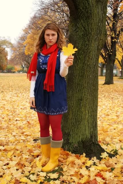
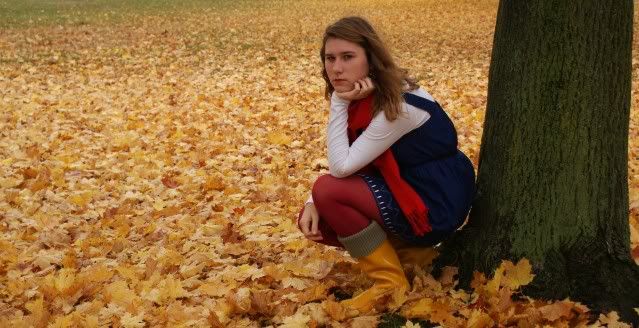
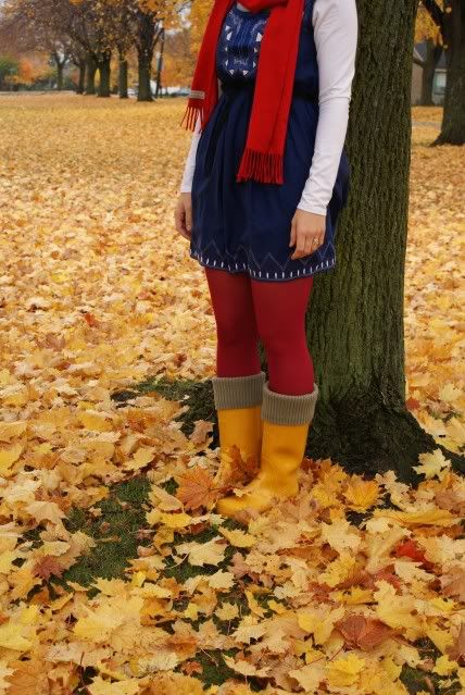
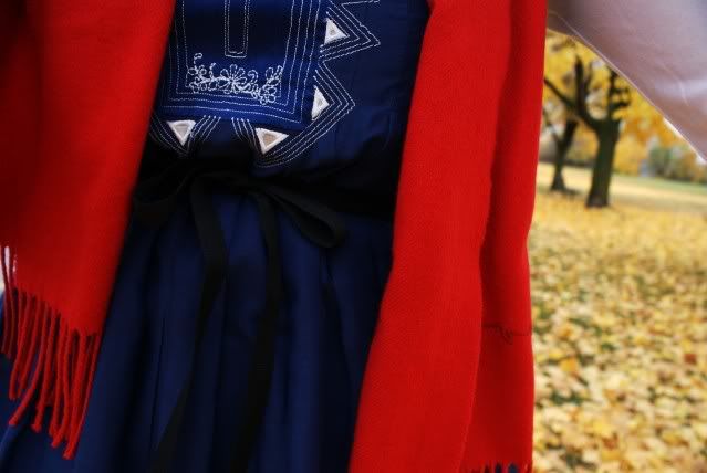
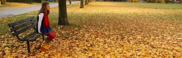
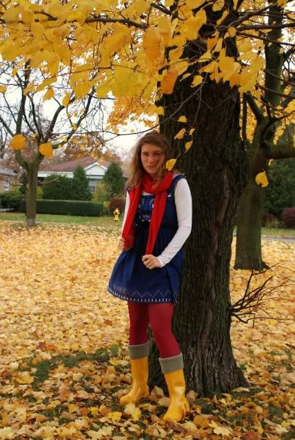
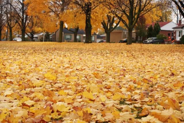
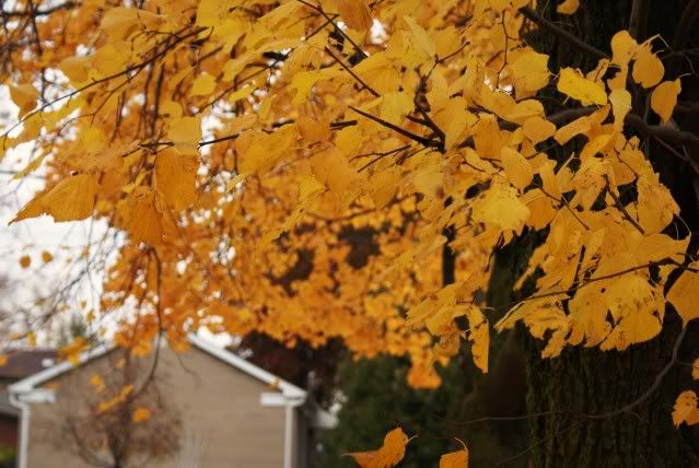
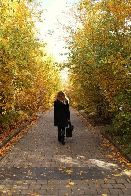
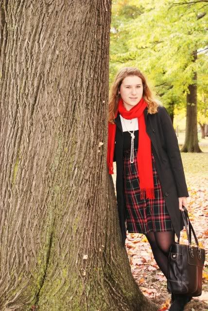
These were taken yesterday, although since I haven't gone to sleep yet, I feel like I'm still living in Friday. I finally go around to taking pictures of the beautiful trees outside. I wish I had taken pictures earlier when there were more leaves on the trees, but nonetheless, the view is still breathtaking. I love fall, and I'm sad that soon it will be over.


Shoot Raw But Make A Copy? Why?

Today's image is a simple reflection of fall foliage interspersed with the predominate pines. There's two way to approach this type of shot. One would be to go crazy with the color and highly saturate the scene. Another would be to go very soft on the colors and let the reflection speak for itself. I looked at both and today's final image is the results of a lot of contemplation and rumination. It wasn't an easy decision, based on my past performance of being very heavy handed with the saturation. What you see is the muted colors. You might be able to imagine what the bright colors looked like.
Color is such a subjective thing in photography. There are some things that require "proper" color such as skin tones. There are times when the project itself requires "proper" color. If you're shooting Fred's Sweater Emporium's rose colored, top of the line, sweater, you'd better be right on the money with the color or you might not get "the money". As long as the aim of the image is artistic, "proper" color is pretty much whatever the "artist" thinks looks good. Now, you're not going to be able to convince anyone that you really meant the model's face was, in your opinion, supposed to be orange, but using Hue/Saturation to make her/his shirt blue rather than yellow shouldn't be a problem. That would be an artistic decision. Maybe yellow would clash with the surroundings and blue would complement it. So, make it blue. You might get some funny looks if you were shooting a client for money. They might screw up their faces and say "but I don't have a shirt that color".
So, today's image is an abstract and beauty is in the eye of the beholder.
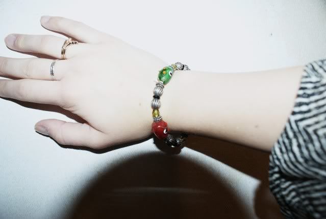
hands, touchin hands
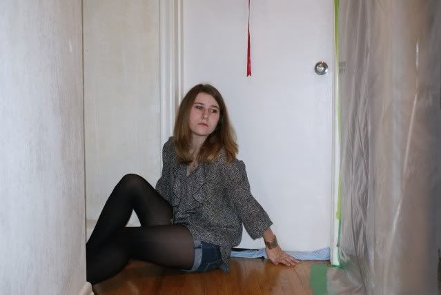
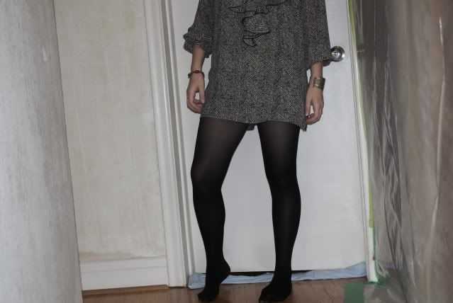
I'm trying to get better at posting, but school makes everything so difficult. Nonetheless, I took these pictures before going to school this morning. We're renovating at the moment, so I felt the need to take advantage of the way the house looks. I felt it went well with my outfit.


tights, unknown. shirt, thrifted. shorts, American Eagle.

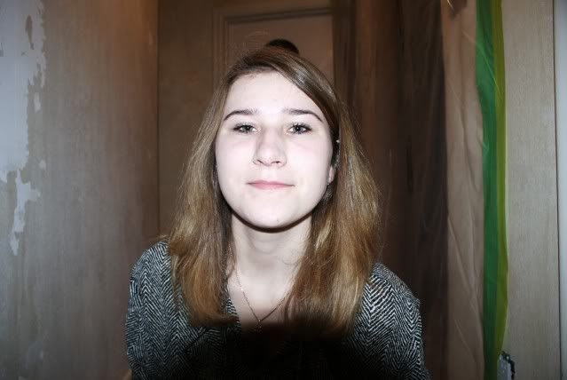
I don't like this picture of myself, but I like how my eyes look, so I posted it anyways. :)


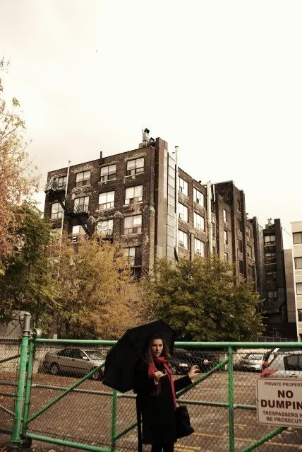
Halloween is this Saturday, therefore, my best friend and I decided we're going to have a photoshoot in our costumes, so I will have a special feature on Sunday. The problem is that I still do not have a costume. I can't decide what I should be. Hence, suggestions would be amazing. I want something out there and creative, nothing skimpy.
Ps. My new favourite show is GLEE! A must watch show.

No Jedi Zen Here
 There's nothing like falling back into what's comfortable. The other day (Monday in fact) I said I wanted to lean toward the subtle colorations found in the images over at Landscapes 2.0. Today I'm feeling a little bit like an addict who's fallen off the wagon, slightly. While the overall effect of today's image is a little more restrained than a typical, full out, in your face, image that the gallery is known for, it certainly can't be called delicate. It does have several elements that "should" please the eye. There's the tree taking up the entire right side of the image, holding the viewer into the shot. There's the strong leading line that brings the eye down to the lower right hand corner with the rocks bright enough to arrest the eye. The "white spot" in the top center of the image isn't white at all in the original, but gives that impression in the less than 200 kB thumbnail used here. The Red Channel pushes up pretty close at about 250. but the Green and Blue Channels run down at the 215 plus or minus level. The net effect is a, sort of, beige tone. To find out about some of the "extras" that made this the image that it is, hit the "read more".
Starting with the Raw file kind of takes a "leap of faith" to think this image is going to go anywhere. It looks rather brown and drab, not a whole lot of color to it. In order to get to a "starting point", the original "original" began life as a three shot HDR composite. One shot "correctly" exposed, one two stops under and one two stops over. In Photomatix Pro it became a "photo realistic" image rather than the heavy, illustrative style that can be made in Photomatix. The "under exposed" shot contributed to the sky and water, while the "over exposed" probably added some detail to shadow areas of the tree and along the shoreline.
This is another shot from our recent trek to Maine. It happens to be Eagle Lake in Acadia National Park. Almost everywhere we went during that long weekend we had warming, graduated, neutral density filters with us. The sky was overcast enough that the chance of ending up with a completely bald sky was a pretty sure bet. This happened to be one of the few times the filter was in its case in the car. Oops! The filter I was using most during the shoots was an Cokin P197 Warming Filter, hand held in front of the lens. The P series Cokin rectangular filters are great for a quick change of the look of an image. We carry several variations in a small Cokin P sized case.
So, what's a guy to do? The image lends itself to the warm, moody feel of a shot taken with something like the P197. As it happens, Photoshop has an adjustment layer called Photo Filter and has three Warming Filters to select from. I bounced through each of the Photo Filters PS has and decided the 81 Warming Filter gave the right feel. As is my typical approach I had the density of each filter cranked up to 100% to show the "over the top" effect of the filter. After zeroing in on the 81 I was able to back off the density to get the right amount dialed in.
Would it have been nice to have remembered the Cokin filters when the shot was taken? Sure. Was it wrong to fudge it with the Photoshop Adjustment Layer? No. It's an "artistic decision, not religion.
Just A Quick Update

I Feel Like Luke Skywalker


Today's image required a lot more work than you might think. The smaller image that goes along with the main image is one of the masks used to separate the sky from the trees. It was surprisingly easy to produce, using some of the latest techniques I've been playing with. It actually sounds much scarier than it really is. I used a couple of Alpha Channels and the Calculations feature in Photoshop to make short work of coming up with the mask. It's shocking how good a mask can be made in a very few minutes using those two items in concert. Today's mask isn't perfect, but adding a slight Blur and cleaning it up with the Dodge and Burn tools would probably come up with a mask capable of capturing single strands of hair.
That said, how good is today's mask? Good enough (I hate that phrase) so that a 16 x 20 print, viewed from a typical distance of five to ten feet, would appear perfectly masked. Close examination, hand held, would also pass muster if the viewer wasn't told that a mask had been applied. It's that good! As I said, it's not perfect and I still have to strive for that Jedi "let the force be with you" goal of "do or do not, there is no try". Mastering masks is the key to being able to do anything you'd like in Photoshop.
In today's image, the sky had to be enriched. The information was there, it just needed to be brought out. In the final image it's probably two stops darker than the trees. Just bringing the exposure down by two stops killed the leaves in the trees and the "whiteness" of the birch. The top of the birch tree became a gray mess. Once the mask was made the sky, the trees and the water could be treated as three independent objects. The sky was darkened, the blue in the water was brought out and the trees could be developed to maximize their impact. All in all, for a first shot at using "the force" to control my "normal" (that's something I don't get referred to as being very often) urges to go bright sort of came out okay.
this is my life.
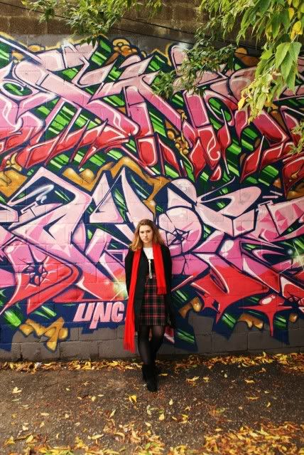
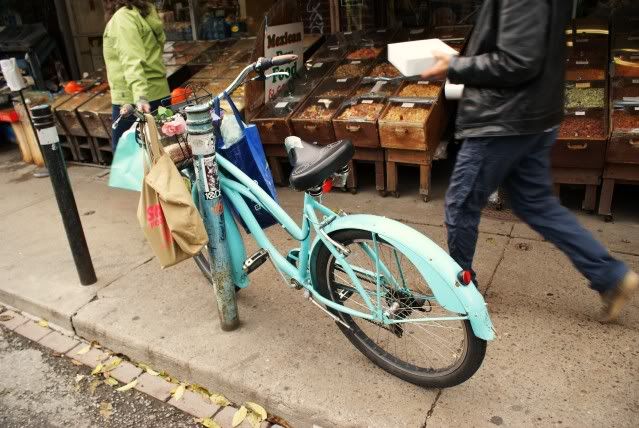
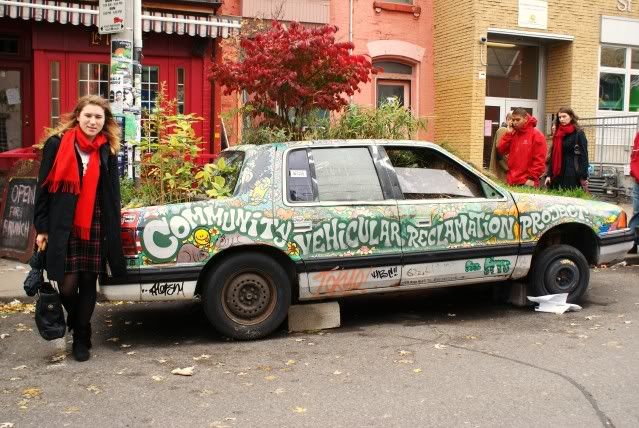
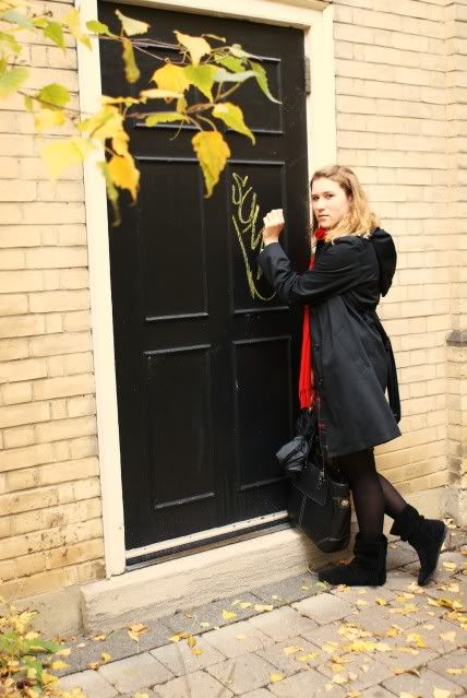
Today my best friend and I went down to Kensington Market so I could interview a local shop keeper for my university's fashion blog. After that we walked around the streets and took lots of pictures, so all the pictures with me in this post are taken by my friend.


It's A Big Day At The Gallery

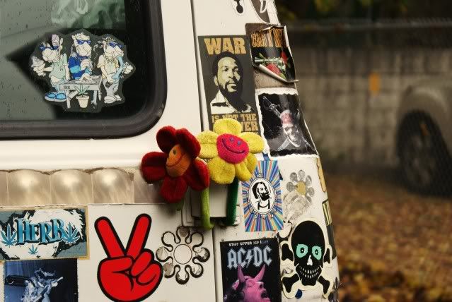
I've been pretty faithful about connecting the GPS unit to the camera lately whenever we're out of the immediate area. Last weekend was no exception. I can get back to this truck any time we head back up to Maine (if I wanted to). I clicked on the metadata in Adobe Lightroom and went to the GPS data. Popped on that, it opened Google Maps and took us right to the location of the truck. Pretty cool. It also showed that there was a user picture taken at that spot. Clicked on it and up came a 360 degree image of the area. I spun it around and lo and behold, there was the truck. That cracked me up. Okay, so I know I can return to reshoot this truck any time we feel like taking a 400 mile (one way) drive. I don't think it's going to be high on the todo list any time soon.
Last night a couple of friends were over and I showed them the little GPS trick. One is a JPEG shooter and commented that the color on the truck was "pretty dull". I took that as a slight challenge and knew I had found today's image. I pumped up the colors using the usual techniques (several previous posts have detailed my workflow) and then added some touches strictly needed on this image. The windows reflected too much green, making them look more like they belonged on an alien spaceship than a rusted out old truck. I did a selection of the three windows (the two front and the driver's side)and pulled the saturation down a lot. The first time I pulled the slider down the entire image desaturated. Oops. Easily corrected by clipping the Adjustment Layer to the copy of the image in the layer below. The other work that this image got was quite a bit of Dodging and Burning. I opened the shadows under the truck ever so slightly (trust me, it can be seen in the original) and under the bough to the left. The hood got a some Burning on the sides to give a little dimension. The two red lights on the fenders were touched with a little bit of a Burn just so they wouldn't overpower the rest of the image. There's all sorts of little hits with either the Burn or Dodge tool around the truck itself to pull some things forward and push other things back.
It was a fun development of an image and I don't think my friend can say it's "pretty dull" anymore.
tears
Would you stop all the linesComin out from your mouthIsn’t my stories not enoughTo much lies for meSo please forgive me
Your car my house our phonesWhere all the memories lies
All the tears that aren’t wastedAll the anger that explodedAll the things that we’ve been throughWouldn’t pay a thing if we end this
Your car my house our phonesWhere all the memories lies
All the tears that aren’t wastedAll the anger that explodedAll the things that we’ve been throughWouldn’t pay a thing if we end this
This is just the half partHalf part of my lyrics all the tears that aren’t wastedAll the anger that explodedAll the things that we’ve been throughWouldn’t pay a thing if we end thiss
Your car my house our phonesWhere all the memories lies
All the tears that aren’t wastedAll the anger that explodedAll the things that we’ve been throughWouldn’t pay a thing if we end this
Your car my house our phonesWhere all the memories lies
All the tears that aren’t wastedAll the anger that explodedAll the things that we’ve been throughWouldn’t pay a thing if we end this
This is just the half partHalf part of my lyrics all the tears that aren’t wastedAll the anger that explodedAll the things that we’ve been throughWouldn’t pay a thing if we end thiss
You'd Never Guess Where We Were Over The Weekend

You'd think today's image could have been dropped in without looking at it twice. Not so! We had some light coming in from the left. You can see that where was a break in the clouds producing some fairly harsh shadows on the rocks. The exposure had to be a compromise (isn't everything) between the rocks and the moody sky. Today's image probably has more adjustment layers than ninety percent of the images on the blog. Each piece needed its own attention. The rocks themselves have about a dozen different Adjustment Layers, including the typical individual Hue/Saturation layers, a couple of Exposure ALs, a Curves AL, two Levels ALs and a Vibrance AL. The masks for the Adjustment Layers looked like Swiss Cheese.
One of the surprises I found as I developed the image was the green in the water. Typically green comes out in the Yellow Adjustment Layer. Almost nothing in the water popped up with the Yellow AL, but when a Green Adjustment Layer was applied out came the green in the water. At first I thought I'd just kill it and leave the water as a cold gray/blue expanse. The more I looked at it and played with the amount of green saturation the more it became evident that it was an important piece of the puzzle.
The sky was another multi-step exercise to bring out it's richness. There was detail that could be seen, but it was pretty pale. In order to bring it to its full potential almost as many Adjustment Layers were used on the sky as was used on the rocks. It needed to be pushed and pulled to get to the right balance of detail versus brooding sullenness. It could be fully rich and detailed and still have the same foreboding quality you see now.
All in all, the long weekend was a lot of fun, a lot of miles and some images that have potential. I do have to thank a friend, Rick Tyrseck, for his GPS file of some of the best lighthouses and harbors for shooting. It proved to be invaluable. It was sort of comical to try to find the next harbor or lighthouse and see that the GPS said it was "only" two miles away. We'd hit the button to have the unit figure out the directions, only to find that, by car, the point that was "two miles" away was forty miles by road. Nineteen miles up the peninsula we were on, two miles east or west and nineteen miles down to the object of desire. Cute.
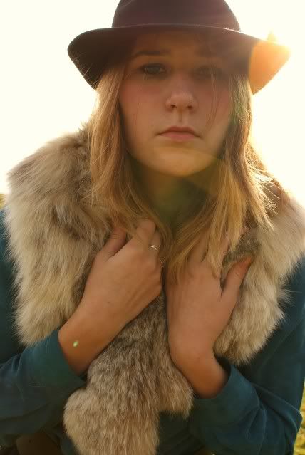
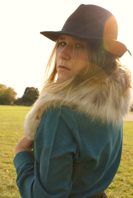
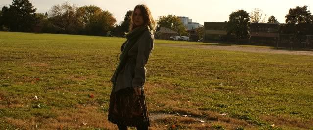
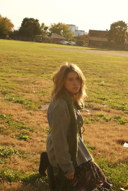
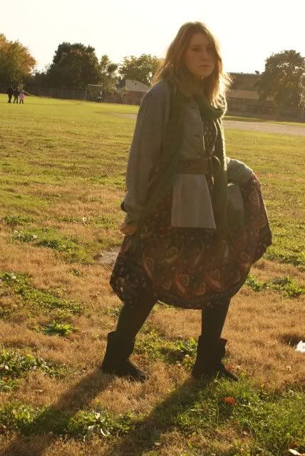
with sepia-toned loving
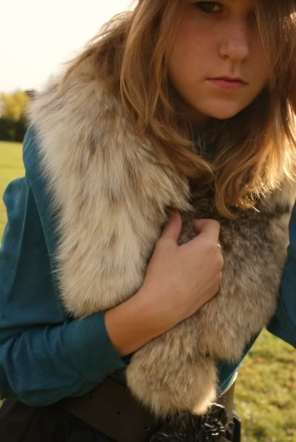
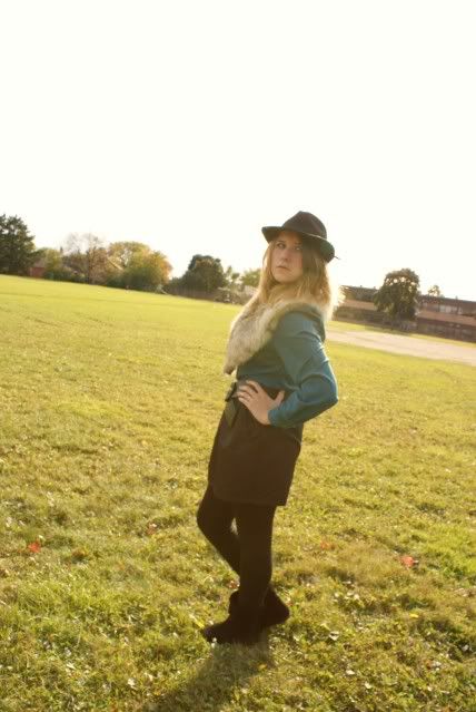
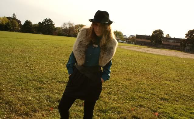
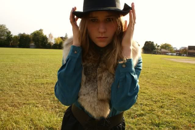
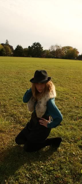
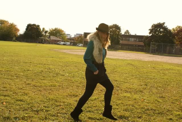
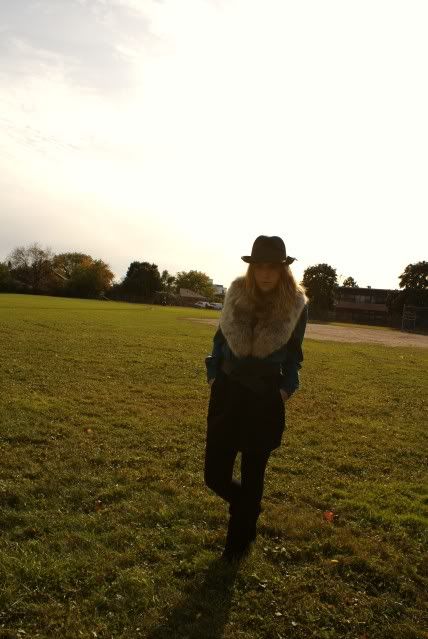
I took a study break today and did a little photoshoot. I went for a sort of grungy/western/hippy look. The hair and makeup was inspired from the new Burberry ad's with Emma Watson, although I didn't go that heavy on the eye makeup. I love how the photos turned out. I took so many and all of them but a couple turned out really well. It was so hard to pick which ones to post. Anyways, I hope you enjoy all of them!


*Do not use these pictures without my permission.*
Hope you're all having a lovely weekend.

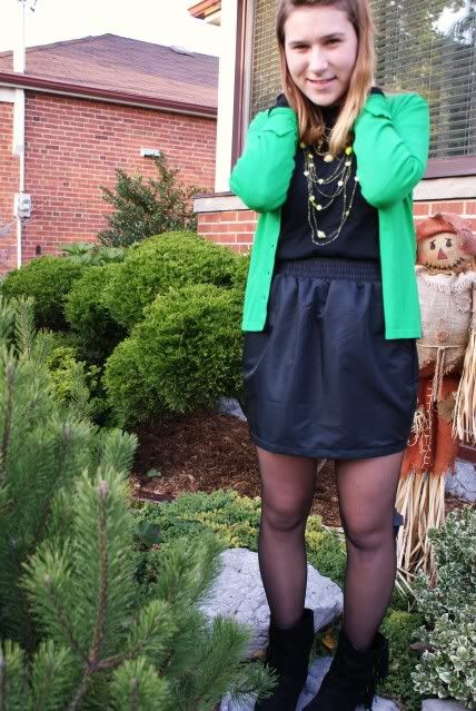
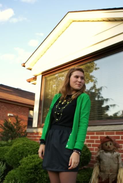
toxic
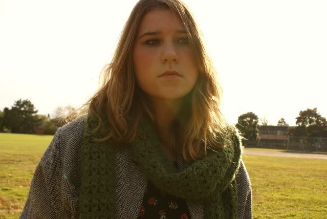
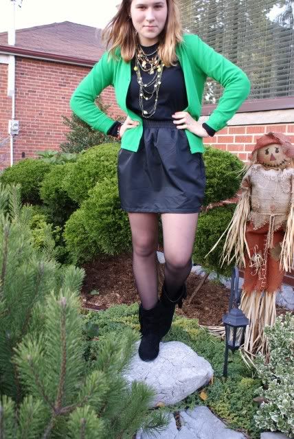
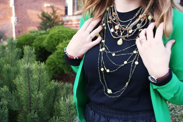
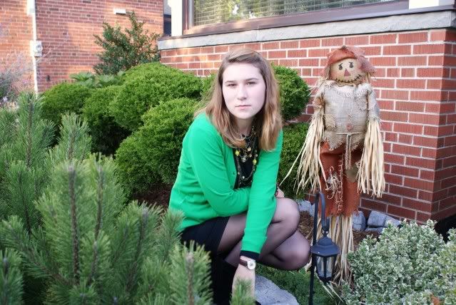
I've been wearing a lot of green lately. This whole past week, since Monday, I've been wearing outfits that had green. The photographs don't do justice to the colour of this cardigan, but for some reason it makes me think of the age old song Toxic by Britney Spears.
University life is getting very stressful. I had my first and only mid-term today, and this weekend will be spent locked in my room going through all my readings.
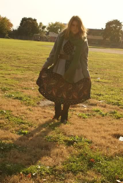
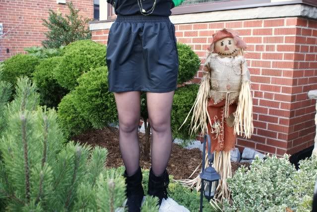
I was in desperate need of a black skirt, so I finally ventured into American Apparel where I saw this gorgeous one. It's prefect because it can be dressed up or down and it's really comfortable.
Subscribe to:
Posts (Atom)