What Passes For Fine Art

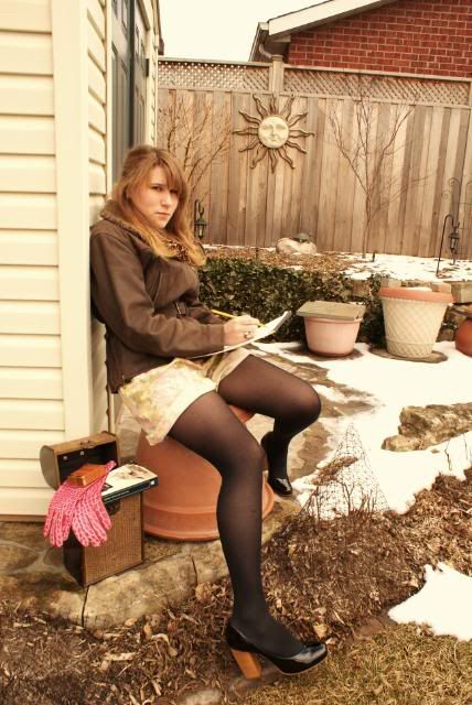
I happened onto a website the other day offering "fine art" prints. The prices were pretty exciting to say the least. Here was a person I'd never heard of offering ink jet prints for as much as $1000.00+.  A quick check using Google confirmed that, basically, no one else had heard of this individual either.  I looked at the portfolio being offered and saw shots that looked like the early days of my pushing buttons in Photoshop just to see what would happen. One looked like it might have been taken in Italy somewhere and had a four point posterization filter applied. Another looked suspiciously like an image with a Water Color filter stuck on it. If someone is going to just push buttons and pass it off as art, they'd better rethink their pricing. Today's image took a lot more steps than a single button push. To find out what was done, hit the "read more".


Today's shot is similar to what I saw on the website I came across the other day. That shot wasn't a panorama, but the finish was posterized. Today's image is also posterized, but where were several steps before (and after) the Posterize filter was applied.


The first thing was to remove any grain (noise) from the bigger areas, without softening the details. A check of the Channels Panel showed that the Green Channel had the lowest noise and least contrast. The Green Channel was dragged onto the Create New Channel icon found at the bottom of the panel. A Find Edges filter was applied to the Green Copy Alpha Channel to isolate the edge detail. Next, a Levels Adjustment (not a Levels Adjustment Layer) was used to eliminate any specks in the large white areas and strengthen the black lines of the edges.

Back at the Layers Panel a copy of the Background Layer was produced by using CTRL J as a shortcut. A posterize filter was used to bring out the distinctive poster effect. To insure sharp lines the CRTL key was held down while selecting the Green Copy Alpha Channel. This made the edges a selection. Clicking on the Create Mask icon in the Layers Panel constructed a mask with the lines of the Green Copy Alpha Channel dropped out, letting the crisp lines show through.

Normal sharpening and vignetting techniques (discussed previously her on the blog) were employed to finish the image.

The Start And The Finish

Today's image is another one of those that has a fairly dramatic change from what came out of the camera to what ended up in the frame. The thought process was that the image needed to be much "darker" in mood than the light, airy window scene that was shot. Producing the drama was a project that does take longer than the quick "corrections" that we normally do to create a fine art piece. There are several major changes to get to the final print. Cropping is obvious, as is coloring the sash, the liquids, the stoppers, and the floor of the bay window. The number of individual layers adding up to the result is considerable. Each color change is on its own layer. Each burning and dodging has its own layer. Every angle of the mullions (center dividers in the window) has its own coloring and layer. There are clipping layers, blending changes, and flips from RGB Mode to LAB Mode and back. The layer panel looks like a scroll rather than a panel. If you'd like to find out more about the changes in the color of the liquids, hit the "read more".


Whenever I do a change in color, whether it enhancing a woman's makeup or changing the color of the liquid in today's image, the method is pretty much the same. Basically, it's hit it with a hammer and then soften the blow. I just did a "makeover" on a woman, touching up her makeup to have the result a little more dramatic. In that case I tool Pure Violet Magenta as a foreground color, with a fairly soft brush and, on its own layer, drew in some "eye shadow". At first glance it looks like you'd either be a six year old coloring a picture of mom, or going for clown makeup. Total overkill. The key to making it look more like properly applied makeup and less like you were painting a wall is to change the Blend Mode to Color. Instantly it gets to looking better. Now, because you have the color on a separate layer, bring the Opacity down to taste. It's much easier to go nuts and bring things back than not to go far enough and have to either start over or try to add more color. Either way is a hassle and more time consuming than being able to "fine tune" using the Opacity slider.


The same technique was applied to the liquids in today's image. Each color on a separate layer, be outlandish with the color selection, switch the Blend Mode to Color and dial it back with the Opacity slider to get the color right where you want it.

It's not a hard trick to master and comes in handy for a wide range of subject matter.

How To Get A Model To Pose

Based on the title of today's post you might think it's a little "tongue in cheek". It's about impossible to get a "critter" to pose, unless the little guy is of the inquisitive sort. Some animals are shy, some are bold and threatening, some are just curious. I'd like to say we snuck up on this guy out in the tall grass, but the truth is he was in the St Louis Zoo. Max (that's what I'll call him) and his buddies were wandering around their enclosure, popping up on their hind feet every once in awhile. They'd sit there for a moment or two and then scamper off to play. The key to isolating a "model" like Max is to use a shallow Depth of Field (DoF). Keeping the subject sharp and creating some bokeh as a background serves to "pop" the subject out from the background. Some people object to zoo animals in photograph. Their thinking is something along the lines of not enough suffering went into "getting the shot". I don't know? I don't "suffer" a whole lot when I set up a top table or do a product shot with a light tent in the gallery. I'm nice and warm (or cool, depending on the season), I have a beverage nearby, I'm controlling the light and life is good. There are times when a field trip is called for and hunting down an elusive whatever is the way to go. If a client is paying you for a shot of a mountain goat in Rocky Mountain National Park you'd better not try to fool 'em with a shot taken at the local Cabela's. If you'd like to read the story about how we happened to be at the St. Louis Zoo, read the "read more".


Before opening "The Kayview Gallery" last year, I had a career at a little west coast startup called Intel. Oh, what's that you say, you've heard of them? Oh my! A friend, who happened to be Intel liaison with the Circuit City chain asked if I could go down to Dallas with a couple of peers and him for a CCs manager's meeting. I talked to my boss and he said "if he wants you to be part of the team, go for it". I quickly started looking up flight information and found a couple of likely candidates. It was then I had a thought and called the other half of the gallery. I asked my wife if she was interested in going for a ride. Naturally she asked where and I told her "Dallas". She thought for a moment and said "sure, why not". I had to be there on a Tuesday and Monday would be a travel day anyway, so we left on Saturday morning and were there right on time on Tuesday. The meeting ran two days and we headed back, leisurely, on Thursday. I had told my boss I was going to take Friday and Monday as vacation time.


We went north from Dallas, up into Oklahoma and angled off toward the northeast. As we crossed the Arkansas border we stopped in at the first tourist information kiosk. They had a poster of a striking looking town. Inquiring, we found out it was Eureka Springs and decided that would be our destination for the night. Great little town. Only place I know of that has a five story hotel and every story is a ground floor. (Think about it.) We drove through Branson MO just to see what it was all about and stopped again a little west of St Louis. Next morning, after crossing the Mississippi River we saw signs for the Zoo. Since we had the time, we said "why not" and went to the St Louis Zoo. So, that's the story about how I came to get a shot of Max.

planet Earth turns slowly

The past couple of days have been wonderfully beautiful. Despite the piles of mounting work and the stress that has overcome me, it's impossible to resist the golden sunshine and the relatively warm winter weather. My spring break is over as of today but I'm looking forward to going back to school. Although my sleep deprivation and caffeine consumption will increase I cannot resist the campus bathed in the early springtime glow. Sometimes while walking to and from class I like to stop and look at the beautiful buildings. I'm really anticipating springtime when the trees will bloom and the buildings will once again be covered in ivy.
This leather jacket is my new favourite thing in my closet. Well technically it's really old because my mum purchased it ages ago, but I've never worn it before, so it's new to me. It's perfect in too many ways, yet the colour is my favourite part. The soft brown leather is perfectly luscious and reminds me of the spectacular spring days that are fast approaching.

Hope you all have a wonderful weekend, and hope you're all watching the Olympics! (Canada vs. USA hockey game tonight! Oh the anticipation! GO CANADA GO!!)

Ps. I will be updating my links list so if you want to be linked just let me know.

vintage linen floral shorts. Aldo heels. vintage jacket. unknown scarf and tights. Club Monaco pink gloves.


History Has No Buttons

One of the things I've done as a result of thirty plus years of interest in photography is judge a lot of photo competitions. Something that's sure to garner a photographer a lower than possible score is obviously punching buttons without knowing a little of the history of what the effect is. In Photoshop there's a filter called Solarize. People will click on it, see an interesting effect and say they created an artistic image. Some think solarization, or more accurately the "Sabattier Effect", is something out of the minds at Adobe. The reality is that it's an effect that's been around for about 180 years. Some of the legends of photography are names associated with early experimentation with image manipulation. Have you ever seen, or heard of, a "Daguerreotype"? Louis Deguerre mentioned the effect in some of his notes. He didn't have a name for it, but through experimentation he described it. One of the attributes of solarization of an image is the development of Mackie Lines. Lines of contrast around the most prominent edges of elements in the image. Alexander Mackie is credited with being the first to describe the lines found in the effect. Today's image is obviously not a solarization of the scene, but is another old, wet darkroom effect. To find out what the effect is and how it has become a "button" to push in Photoshop, hit the "read more".


The effect used on today's image had its roots (for me) in high school. It didn't have anything to do with photography, but something I became pretty good at. It was a design class and the first time I had ever made a "blueprint". The smell of ammonia from that class and classes all the way through college defined my early career. I was fairly good on a drafting board throughout school and only discovered that doing it for eight hours a day got to be pretty boring, pretty quick after I got my first job as a detail draftsman. Sorry, but "yuk".


Today's image has an effect called "cyanotype" applied to it. A cyanotype is a "blueprint". Very closely related to the job I found so boring. In Photoshop, it's simply an effect that can be found as a preset in a Hue/Saturation Adjustment Layer. That doesn't mean it's "cheating" to use it, just that it has become a button to be pushed without any knowledge of the history behind it. It's another process that has it's roots back close to 160 years ago.

There still seems to be a debate about what is called "Photoshopping" an image. What most of the most passionate, ardent, strident anti-adulteration of an image folks don't know is that just about everything that can be done in Photoshop comes out of work in the wet darkroom.

So, today's image was made by punching a button in Photoshop. The trick is having the knowledge of where the effect comes from. The use of the heavy vignetting is something that was often found in images of this type. It's paying homage to the past, and knowing that it comes from long, long ago in a far off wet darkroom.

1000 Cranes

When I was very little one of my grade school teachers read my class the story of Sadako and the Thousand Paper Cranes. The story is about a little girl who has leukemia and who believes that if she folds a thousand paper cranes she will get better. Unfortunately she died after only folding 644 cranes (true story). Anyways, I've always loved origami and about two weeks ago I decided that I would like to fold 1000 paper cranes myself. A couple days ago I finished. I started folding these cranes when a small tragedy struck my family, so they have become as sort of miracle cranes. The ancient Japanese tradition says that whoever folds 1000 paper cranes gets one wish (which I have made in honour of my family). The 1000 cranes are also strung on 25 strings of 40 cranes each.

These are pictures of my paper cranes. I folded them out of origami paper, comic book paper, scrapbook paper, newspapers, magazines, notebook paper, wrapping paper, thin cardboard and pages from old children's books.


Make Sure It's Right In The Camera

About ninety percent of the entries on this blog have been about how to do things in Photoshop. You might think that the photography is a minor part of what goes on in the gallery. Actually, getting things right in the camera and then playing is about one hundred percent of what we try to do. To take a poor shot and fight with it to make it into an acceptable image is way too much like work for work's sake. Today's image is a case of getting it right and then finishing it using Adobe ACR (Adobe Camera Raw) or Adobe Photoshop Lightroom or Adobe Photoshop itself. The unique angle of the shot appears to be a natural light shot. Just point the camera and snap the shutter. A couple of things were going on when the shutter was clicked. An SB 600 Nikon Speedlite was fired through a shoot through umbrella, camera left, held high on a stick. If you look, you'll see the modeling on the face of the man at the desk. There's detail throughout the image, even under the desk. All this with an SB 600. Nikon's lowliest flash capable of general use with Nikon's CLS (Creative Lighting System). (The lights that go with Nikon's R1C1 close up rig are specialized and not counted in this discussion. I have the R1 set up and am familiar with its use.) If you'd like to know more about "why" SB600s and "how" the extension stick was made, hit the "read more".


You may have read about a few different extension sticks to use with flashes. This is just another take on the genre of DYI poles. The ones I've looked at have tended to be fairly heavy once they're assembled. One popular stick uses a paint roller extension handle that can be found at your local home improvement center. They can expand to as much as ten feet. Problem is the weight. You have to remember that someone will be carrying the rig around for as much as several hours. The shoot that today's image comes from was four hours of running around a corporate campus. Weight matters in that case. A typical wedding can be anywhere from four to eight hours. The extension arm used was made from the handle of a "Swiffer" duster. It's very light, extends to about six feet, and has a hollow screw tip. A double spigot stud with a 3/8" screw thread was screwed into the hollow tip. It took very little modification and was rock solid once it was in place. A normal flash support knuckle with a shoe mount umbrella adaptor was slipped over the stud.


The "why" of using a Nikon SB600 rather than an SB800 or SB900 is based on two factors. One is economics. I can buy two plus SB600s for every SB800/900. The other point is what happens when the flash fires. Using Nikon's CLS you would very rarely fire a flash of any stripe at 100%. If an SB900 is going to fire at 1/16th or 1/8th power to get the proper light on a subject, the SB600 is probably going to fire at 1/4 or 1/2 power to produce the light. I understand that I can't throw a beam from an SB600 50' from outside in a parking lot through a window, but I really don't find that I do that very often (in fact I've never done it). So, if I can get the same amount of light (yes, I know, greater battery usage and longer recycle times) using a flash that cost less than half the alternative, the ROI (Return on Investment) becomes very clear. If I "need" the power of an SB900, I'll buy one, but the job I'll be doing will pay for that flash.

It's The Simple Things

Sometimes we make "hard" the point of what we're doing. Today's image "looks" pretty simple, but it took more work than you might expect. Things that should have happened in the camera didn't. The light spillage on the background made it a very dark gray rather than a pure black. The angle the stem comes into the shot was steeper than what's apparent and the "in camera" crop was too tight to allow for any rotation. Basically it should have been scrapped and reshot. Instead it became a Photoshop project. If the potential of an image doesn't start to develop in the first couple of minutes or if it looks like it's going to take an inordinate amount of time, it gets to the point of ending up with the image relegated to the "never was" bin. The early days of messing around with an images for hours on end just isn't necessary any more. I have discussions with people, see articles in magazines or view tutorials online where very clumsy methods are used to accomplish a task. When face to face with people willing to learn (as I like to think I am) and hear that they're using a method that works, but means fighting to get the job done, I'll put my two cents in (politely of course) and show/explain a technique I've incorporated into my workflow. They can take it or leave it. (After all, free advice is worth what you pay for it.) I've spent about ten years studying (actually studying) Photoshop. Methods I used six, seven or eight years ago have been supplanted by much better, easier techniques that not only produce better results, but are typically much quicker. Rather than fighting with an image I work with a image to do what needs to be done to bring out its potential. To find out what needed to be done to today's image, hit the "read more".


The first thing that was done was a Free Transform (CTRL T) and rotation of the shot clockwise. The resulting blank canvas areas in the corners were repaired by inserting a layer below (CTRL + New Layer icon) and filling it (Shift F5) with the color sampled from the main background. Since the background was some shade of solid black it was easy enough to blur the layer to eliminate any seams.


The lighting error was a case of duplicating the layer (CTRL J), changing the Blend Mode to Multiply, adding a Layer Mask and applying a gradient to the mask. That evened out the light.

After the "corrections" it was smooth sailing with the normal color correcting, sharpening and vignetting. Yes, there is a vignette on this image. (Force of habit, I'd guess.)

fools in love they think they're heroes

Today is Valentine's Day. The most bizarre holiday there is. I don't even consider it a holiday. On this day, people who are single are only reminded of that fact, and for those in relationships there is pressure to buy candy and flowers, and to plan the perfect romantic day. I personally feel that if you love someone, any day should be special. Nonetheless, for those who do enjoy this day, I hope you have a splendid time doing whatever it is you plan to do.
-----
Red lips.
Red nail polish.
My contribution to this most "romantic" of days.


unknown boots, tights. vintage vest, polka dot shirt and skirt. La Vie en Rose long sleeved shirt. jewelry - gifts.

Ps. For those wondering, this is a part of my house that is being renovated. It's become my favourite place to take pictures.

none of us were angels

This past week I've learnt about life.
I've opened my eyes to the world.
Sometimes it's important to just live.
Sometimes we need to see the miracles that occur every day.
The little things.
Life is too precious to waste away.
Don't let darkness settle.
Live your life.
Don't be scared because in a flicker it can all disappear.
-----------
It was a weird week. Not enough sleep. Too much caffeine.
I need a change.


UB jacket. socks-gift. AA dress. vintage tunic top. unknown boots.


Setting A Mood

Sometimes you want to set a mood with an image. That's the case with today's image. It has a couple things working for it. It's toned down to show the darkness of the forest in the early morning light for one. Another is the use of the reverse vignette. Not all vignettes have to be from a lighter center to a darker edge. Here we see the image fading off. The branches of some of the trees can be seen going out into the softening edge. There a few things to consider when you have this sort of image. Just the same as a properly produced music album (CD) has an ebb and flow to it, so should a gallery show. If every image is bright and cheery there becomes a sameness and the show quickly grows boring. Again, like a music album, you want to have a break in what's expected. A rock band with a ballad or two space out within the selections gets more attention than "just another" rock song. Broadway shows are the same. Take "Les Miz" as an example. A pretty sober story about redemption where the hero dies in the end. In both acts you find light moments with the innkeeper and his wife. They bring the mood up before going on with the morality play. The same thing, like the music album or the Broadway show, holds true for a gallery show. Today's image was the lead image as people entered the building. Further along they came across many of the images you can find here on the blog. Scattered about were images of total whimsy, meant to put a smile on the face of the viewer. What I consider to be the "best of show" image wasn't the last image in the walk through. It came just a couple positions before the end. If you'd like to find out more about how today's image was finished, hit the "read more".


This is yet another shot of the stream on Kelly Stand Road in lower Vermont. After shooting the heck out of the stream we looked around for other scenes. You can still see a hint of the stream in the extreme bottom of the shot.


The body of the image was handled much the same as many of the images here at the gallery and the techniques have been explained to death in past posts. The spotlight on this image is the method of getting the fade in the vignette. It's pretty obvious that this has a square vignette. Rather than using a copy of the image to build the vignette this has a white background layer. The shot was made just a little bit smaller than the full frame of the image, so the white layer was visible behind. The reverse vignette is actually an Outer Glow Layer Style (double click on the colored area of the layer to bring up the layer styles dialog box). Playing with the Size and Spread of the glow produced the fade. Changing the Blend Mode to Overlay allowed the detail to show up in the vignette.

The Importance Of A Vignette

I was at a meeting last night and one of the folks there asked me how often I put a vignette on any of my images. My response was "every time". Today's image gives an example of the improvement that is made to a shot simply by adding one more step to your processing. In order to make sure the effect of the vignette can be seen in the "for the web" version of the shot it has been left pretty ham handed. If you look at almost every image posted here on the blog you may be able to see a vignette on the image. A notable exception (since it's the posting just below this one) is the highly graphic type of image recently featured. Today's discussion is a little unusual because to shows the finished image, the next to last step and the vignette itself. We'll take them in order. The shot on the upper left has been color corrected, selectively blurred and sharpened. (Blurred and sharpened is not as strange as it might seem.) Lower Left is the vignette itself and the right hand image is the finished shot. To find out how the vignette was made and applied, hit the "read more".


If you look at the original shot (upper left), you can see that there is nothing holding you in the shot. The door is a big distraction and your eye is drawn to it as it is the lighter area of the image. In the right hand image, the door is still there, but toning it down through the use of a vignette has made it less of a focus. Your attention is centered on the woman and her camera.


The vignette is another of those things that will take longer to explain than it does to do. It starts with a copy of the corrected image. The square Marquee Tool (M) was selected and a the feathering set to (in this case) 200 pixels. The marquee was drawn out from slightly inside the upper left and pulled down to the lower right. Spacing was about equal distance all around. Making sure the vignette layer was selected, the Delete Key was tapped and the center of the image dropped out. You might notice that, even though the square Marquee Tool was used, we wound up with a fairly soft "circle". Your "marching ants" (selection) will definitely appear to be a somewhat square oval.

If you're a frequently reader you know I'm a big fan of Blending Modes. In this case the Blending Mode was changed to Multiply. The Multiply Blending Mode darkens the image. By having only a highly feathered outside ring we've produced a vignette. There's a couple things going on using this technique. The vignette layer was made before the final sharpening (using the High Pass Filter sharpening technique) was done. BTW: While the image was being sharpened the visibility of the vignette layer was turned off. Therefore, the vignette is now darker and less sharp than the overall image. It's focusing the viewer's attention on what's important.

A vignette does not have to be centered. The vignette on the image in the post of February 1st is higher and wider than being centered.