white rabbit legs
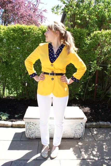
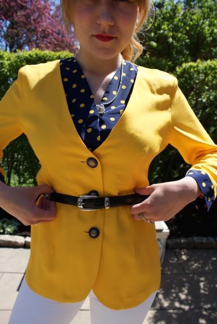
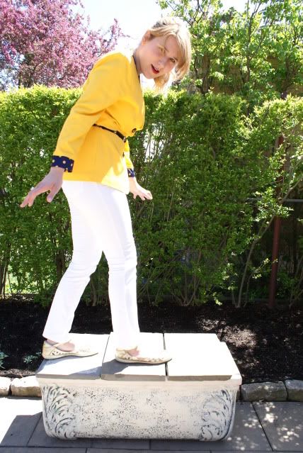
I hardly ever wear pants, so why would I ever wear white pants? I don't know the answer to that. I never saw myself as someone who would dare to wear white pants, but when I found this pair in my mom's closet, I just had to take the chance. Lately I've been trying to take chances wearing things I wouldn't normally, and it's proving really fun and exciting to see what I can come up with. I suppose I was kind of scared to wear these pants, simply because they're white, and white isn't particularly a colour I like wearing, especially when it comes down to pants. Yet, the thrill of putting them on and going about my daily life in them gave me a huge boost of confidence in trying other new things.


A Riff On Rockwell's "Main Street" in Adobe Photoshop CS5
 In the post of March 22th I told about visiting the Norman Rockwell Museum in Stockbridge Massachusetts with some friends. One of the things I mentioned in the post was that I wanted to try doing some “recreations” of Rockwell’s paintings in photography. I thought (still think) it would be interesting to come full circle, since Rockwell used photography to help with his visualization process, to attempt to “update” his paintings as digital images. Rockwell was not a photographer and employed the services of various professionals for his needs. He oversaw the staging , angles, posture, costuming, and any other aspect or what went on during a shoot. He just didn’t click the shutter. Once he had the reference photos he’d take liberties (artistic license I guess you’d say) and make adjustments or enhancements where needed. On one hand he was more than willing to alter “reality” and on the other he’d do things like giving a female townsperson money to go out and buy a yellow dress to pose in. The irony was that his reference photos were in Black & White. With his painting “Main Street” he took the liberty of putting in some of the nearby Berkshire Hills into the background behind the stores on Main Street. The Berkshires are lovely, but cannot be seen from the center of Stockbridge. I took the same “artistic license” in today’s image. The big difference is the hills in the background are from a drive along the Blue Ridge Parkway, a pretty “fer piece” south of anywhere in New England. To find out about the machinations I had to jump through to make today’s image, hit the “read more”.
Rockwell’s painting is a straight on shot of the street. It’s actually an impossibility in that he shows no perspective. Each building is front on with no sides showing. It’s as though he stood in front of the library and painted it. Then he walked down the street fifty feet, set up his easel again and painted Theeler and Taylor’s Real Estate. Step and repeat for the Art Shop, the Stockbridge General Store, and on and on down to the Red Lion Inn. I tried doing the same thing. I took a shot in front of the library, walked down the street (tried to maintain the same camera height and focal length), shot the Art Shop, walked a little more and shot the General Store, etc. You can see, when the series of three shots were manually stitched together there was still perspective.
First thing I tried was using Adobe Photoshop CS5s Photomerge feature to have it do it’s typically great job of making a panorama. No such luck. Because of the shoot and walk, shoot and walk style of gathering the images the Photomerge went crazy and threw up its hands. So, everything was stitched “old school”. Each piece went through its own Free Transform to nudge it into place. The Opacity of the overlapping image was lowered to be able to get the right alignment with the underlying image. It was pretty painstaking and took longer than I would have liked.
Once everything was lined up I had to go through my own Blending of the images (something Photomerge does so well) by using clipped Brightness/Contrast Adjustment Layers. With a big, soft Brush I feathered the seams using the Masks that come with Adjustment Layers. At that point I had a mangled car sitting in front of the General Store. I cloned the car right next to the wreck overtop using the Clone Stamp Toll (S).
Next trick was to create a Mask to get rid of anything behind Main Street in preparation for inserting the foothills. I started off with the Calculations dialog box (Images/Calculations) to get a baseline Mask. I figured CS5s Refine Mask would do a great job cleaning up any problems. What a rude awakening. I sat there going back and forth and the Edge Detection kept making things worse rather than better. Thought “this has to be ‘user error’”. It was. I was applying the Mask to the wrong Layer. Duh! Once I figured that out (after about a half hour of futzing around) the Refine Mask worked great. It’s always “user error”, but determining what the “error” is isn’t always easy.
Next step was to use CS5s HDR Toning to give a little painterly look to the image, which screwed up the sky. That meant a new Mask for the sky and a Gradient Layer (darker Blue to lighter Blue) with an Overlay Blend Mode to maintain some definition and I was pretty close.
All this was coupled with the normal workflow of saturating each color, using High Pass Sharpening and putting a vignette around to finish. What started as a goof at about nine in the evening ended up as today’s image at one in the morning. Boy, I hope you like it.
spring rolls and biscotti
Last night I went out to dinner downtown with my friend, Chris. We had delicious spring rolls, and sweet and sour chicken (so so good). We finished off the evening by eating cookies/biscotti and drinking Starbucks coffee whilst sitting in a Chapters overlooking a gorgeous old building. Overall, a very fun evening.


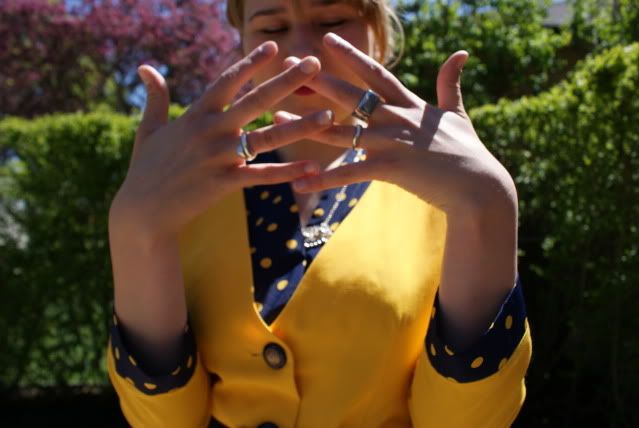
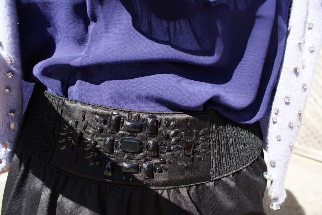
Forever 21 shirt. Marciano skirt and sweater. Unknown tights. All jewelry = gifts. Guess flats.


Ps. Some of the books you all mentioned reading sounded really interesting. If you have any book recommendations please do mention them. I want to make the most of my free time this summer and read as much as I can.

Great Blue Skies Without A Polarizer

Most of the Cokin filters I had with me were either warming or graduated neutral density filters, so they didn’t lend themselves to heightening the saturation of the sky. They tended to give a later (or much earlier) in the day look to the scene. Switching the White Balance to either Cloudy or Shade gave similar, but not as intense, results. Going for either Tungsten or Florescent White Balance increased the blue in the sky and set up an entirely different set of White Balance issues. The whites became very cold and the reds flattened out. The best compromise wound up being Tungsten.
Once the overall tone was chosen normal color correction was employed. A Threshold Adjustment Layer was applied and the Black and White points found by moving the slider left and right. At each extreme the Color Sampler Tool (I) marked the points. A new Layer was put under the Threshold Adjustment Layer (CTRL & New Layer Icon in the Layers Panel), filled with 50% grey (Shift F5) and the Blend Mode changed to Difference. Going back to the Threshold Adjustment Layer and moving the slider to the far left identified the Middle Grey point. Adding a Curves (or Levels) Adjustment Layer provides “eye droppers” for Black, White and 50% Grey. Use each eye dropper on the matching point and color correction is done. The White on the lighthouse is white, the Blacks in the shadows of the rocks are black and the tone is brought into balance with the 50% grey eye dropper.
After any color cast has been removed (technique above), the individual colors can be brought to their best saturation using a Hue/Saturation Adjustment Layer for each color (Red, Yellow, Green, Cyan, Blue, and Magenta). Where almost all Adjustment Layer Masks were used on Monday’s image, almost all of today’s Adjustment Layer Masks were untouched. Some days the masks come into play extensively and some days not at all.
Just one side note. There were a half dozen tourists in the image creating distractions. I tried using the Content Aware Fill found in Adobe Photoshop CS5. It was basically a no go in this image. When it works, it’s amazing. When it doesn’t, you just have to g back to the older techniques.
minimalist
While most days my outfits have me wearing lots of layers or being covered in accessories, there are times when I like wearing a very simple outfit. No jewelry or layers, nothing fancy with my hair, just a dress, some shoes, and a simple pair of tights.
Minimalism is rather wonderful sometimes.
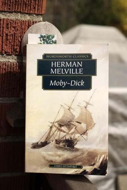
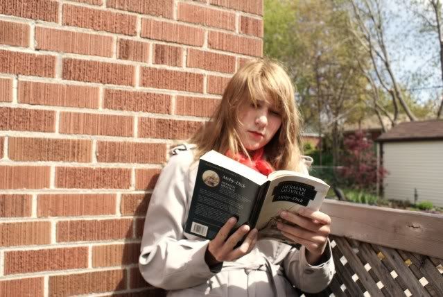
I'm currently reading Moby Dick. It feels so nice to read a book that's not for school.

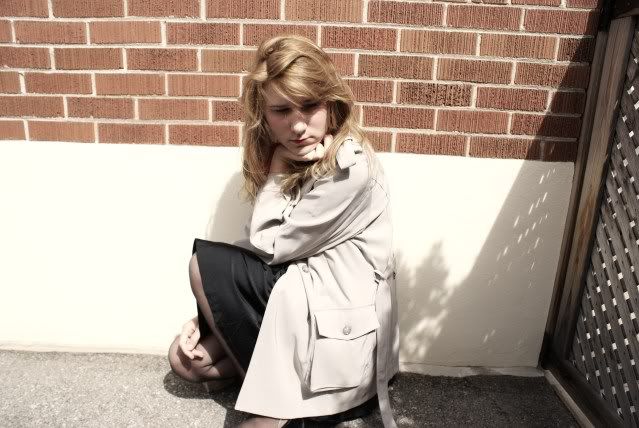
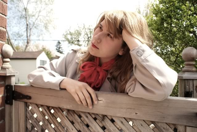
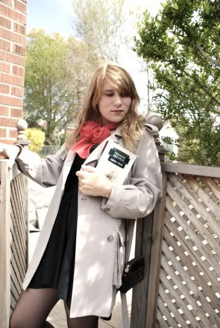
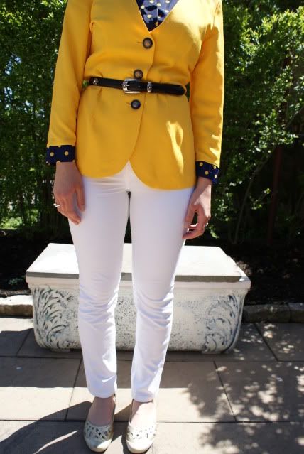
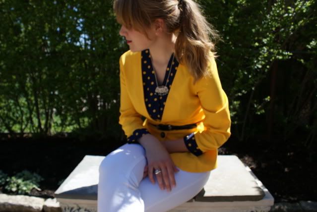
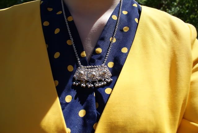
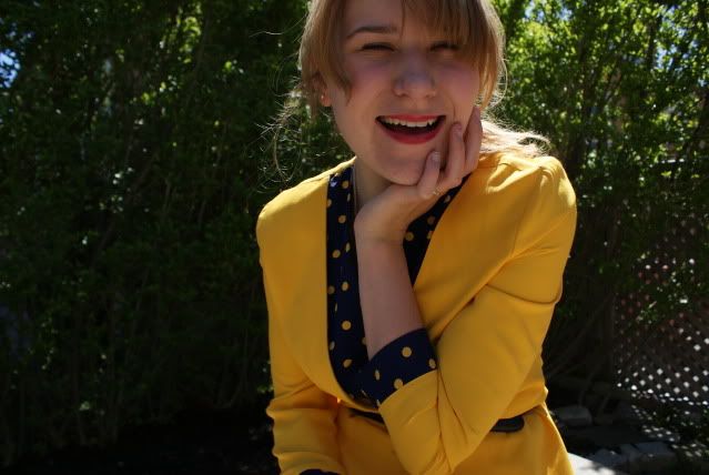
wild animals in the city
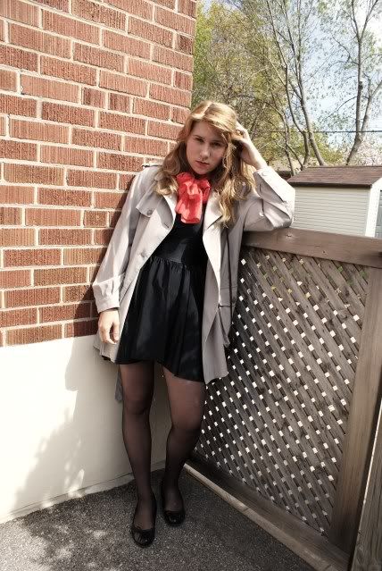
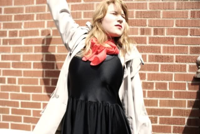
I think that everyone owns a piece of clothing, that for some reason they only wear once every blue moon. As much as I love this skirt, it's that piece of clothing for me. I only recently made it, but it's just something that I might not wear again for a couple months or years. It's not a matter of not knowing how to restyle it, something that isn't an issue, it's just not something I'd want to wear a lot of times.
Do you have an article of clothing like that?


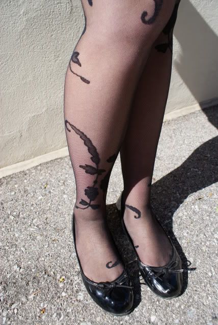
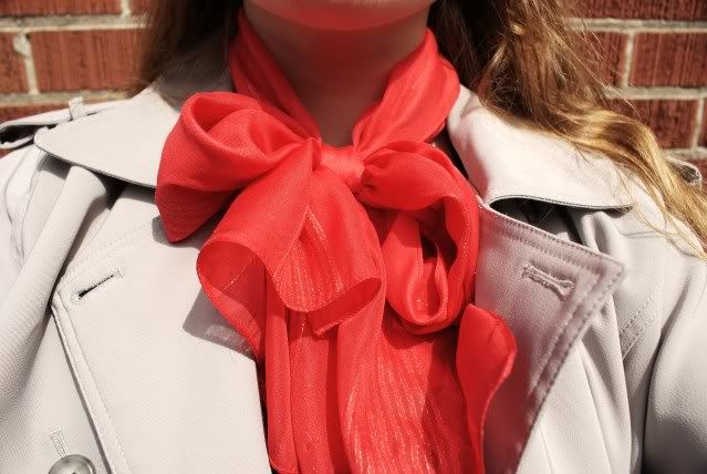
DIY skirt. unknown tights and scarf. Jewelry-Gifts. Guess shoes. AA U-neck dress. Vintage belt.


After Adobe Photoshop CS5 Does It's Magic


On the left is what the Layers Panel looked like after all the Hue/Saturation Adjustment Layers were used. You can see that the only color that didn’t need some masking was the Red H/S AL. Each of the other five needed some tweaking to allow rich saturation in most of the image, while knocking down the saturation in specific areas. i.e. The ceiling coming off the column was way too yellow, so it was masked for yellow. But, the trim ring for the recessed light was a bright gold color that needed the boosted saturation. Therefore, just that little oval had to be “unmasked” using a small white Brush. The yellow was also left cranked up for the niches at the far end of the bar holding a couple of framed pictures.
The cooler near the right side of the image is Stainless Steel. There. The Cyan Adjustment Layer was masked, but the Blue Adjustment Layer wasn’t. That allowed for the highly reflective surface to have a metallic glow while not looking plastic.
You can see in the masking what was saturated and what was brought back. Let me know if you agree.
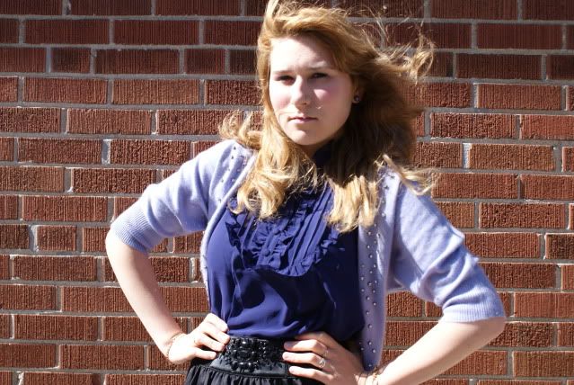
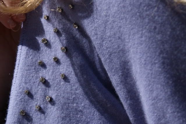
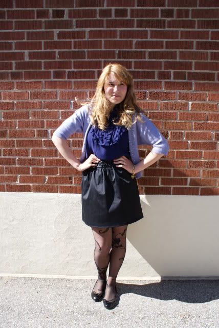
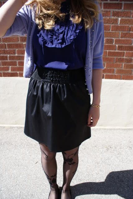
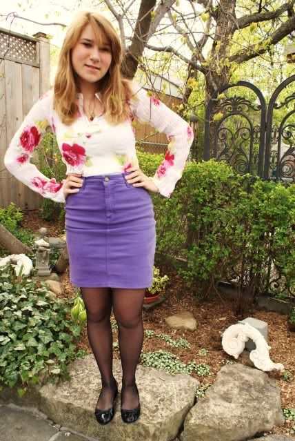
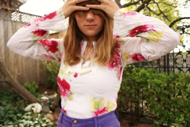
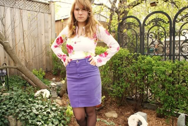
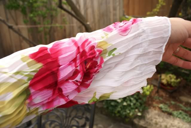
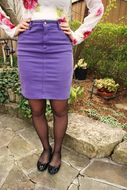
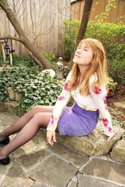
ray of purple light
I bought this purple AA skirt at an AA rummage sale in November. I waited 8.5 hours to get into the sale, so when I saw this skirt, I just bought it. I didn't really think about it much. I was so exhausted from waiting in line, that I literally bought everything that fit me and that I thought was decent looking. I've worn this skirt a couple times before, but I just didn't post outfit photos cause I didn't have time to take them. Love this skirt though. It's super comfy and purple is my favourite colour, so it all works out well.

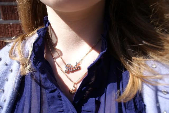
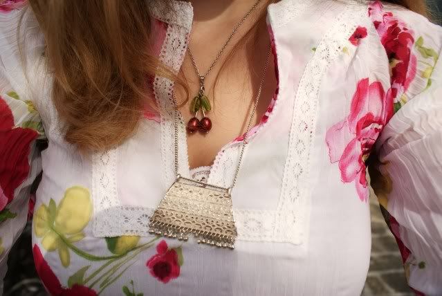
AA skirt. Guess blouse and flats. unknown tights. Silver necklace is vintage. Cherry necklace is custom made. Rings are gifts.


My best friend is a year younger than me, so she's graduating from high school this year, which means prom. I spent the day helping her look for a dress. Seven and a half hours later we came home empty handed. I never realised how hard it is to find a prom dress. I was lucky last year, I literally walked into a store, tried on the first dress I saw, and fell in love with it. I hope my best friend finds a dress soon. :)
After an exhausting day of being on my feet for approximately 6 of those 7.5 hours, I really want to just go watch a movie or curl up with a good book. Have an awesome weekend everyone!
Subscribe to:
Comments (Atom)