neon angel

To explain how I put this outfit together would take a long time, but basically, it started with a purple denim skirt and grey tights, but ended with a neon green skirt.
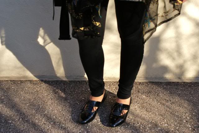
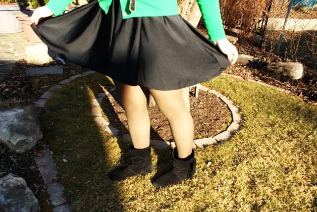
I've been able to wear flats once every couple of days now because for the most part, the weather has been simply beautiful. Although I start exam month next week, the lovely sunshine has been able to put a little ray of light onto my otherwise dreary days.
-----
I went to see The Runaways movie last Friday and all I can is that it was...AMAZING!!!!! I absolutely loved every single minute. I urge everyone to go see it. I don't like Kristen Stewart's acting most of the time, but I think she did a fabulous job, her and Dakota Fanning. It was great to see Dakota in such an edgy role; I really hope she continues to do more movies with an edge.

I'm off to go study. :( Hope you all have a fantastic day, and go watch The Runaways.

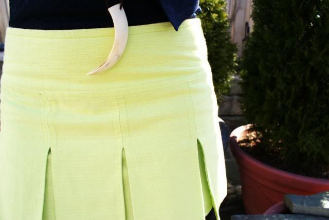
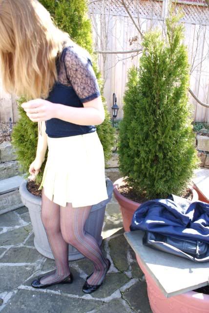
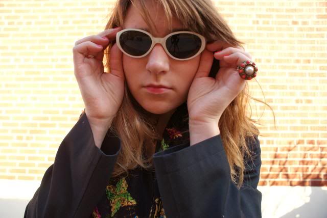
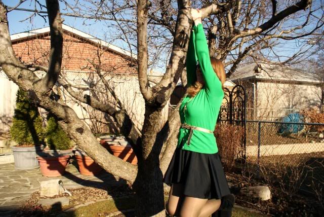
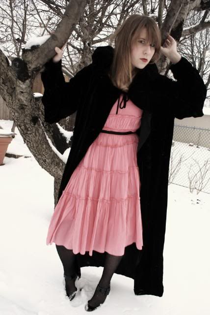
Ps. The surprise I mentioned in my last post was that I coloured my hair. I usually change the lighting on my pictures so my hair colour tends to look either more blond or reddish brown, but the following photos show my hair colour how it is now (used to be light brown with natural blond highlights). Although the sun makes it look more light, it's more golden blond with a bit of a red tint.


Unknown tights. Skirt from Marshalls. Vintage blazer. Rodarte for Target shirt. A&F tank top. Guess flats. Aldo backpack. Jewelry: gifts.

More Fun With Adobe Photoshop CS5

Overnight I was trying to think of another way to demonstrate the power of one of Photoshop CS5’s most talked about new features. You may have seen it demonstrated at a Photoshop World video out on Youtube. I think I’ve come up with a different way to show just how powerful a tool is coming our way. Take a look at today’s dual images. They’re both the same panorama, shot on the Blue Ridge Parkway in North Carolina or southern Virginia. I did some finishing on the top image, boosting the color saturation of each color (Red, Yellow, Green, Cyan, Blue, and Magenta), but that’s not the story here today. Look at the vertical size of each image. Which one makes the more dramatic pano is a matter of taste, but the freedom to use more of your shots is amazing. Are the two images representative of the “same” panorama? As close as possible. I took the thinner image (we’ll refer to it as “image one”) and copied it over onto the thicker image (“image two”). I did the initial alignment by lowering the Opacity of image one to about 45% and, using the Move Tool (V), matched up the sunlit hill just right of center in the background. Then I inversed the colors of image one (CTRL I) and changed the Blend Mode to Difference. That way, whenever pixels matched, the result was black. Next I used Free Transform (CTRL T) to nudge image one into an overlapping scale of image two. Are they matched? I’d said about 98%. There were a few cracks of light showing through the black, but it was darn close. Image one was the best that could be gotten using Photoshop CS4. The Crop (C) was at the absolute top and bottom of what could be cut out of the blended panorama. In fact, I’ve been known to squeeze a sliver of empty space into the image and use the Clone Stamp Tool (S) to fudge in the very top and bottom. Here’s a “real world” example of what Adobe has in store for us with CS5. I don’t think “rocket scientists” or “brain surgeons” have anything over the folks at Adobe. They keep doing hard to believe stuff. To find out more about the details of this matchup, hit the “read more”.

“Image one” was made shortly after we got back from a vacation drive to Tennessee in 2007. “Image two” was done yesterday. Image one was never “finished” with the colors saturated, sharpened, and a vignette applied. Image two was, and also had a Warming Filter (85) Adjustment Layer applied. But, again, that’s not the crux of today’s post. One “dirty little secret” about image two is that about 10% of the vertical size was cut off to position the far horizon more favorably. So, there was even more useable image than shown.

You can see that the bottom “V” formed by the two closest hills is cut off just a bit in image one. CS5 figured out what was going on and completed the bottom of the “V”, including the overlap of the hills. Over on the left hand side the foreground bushes have a lot of detail in the leaves. Rather than filling the area with a fuzzball of colors with no form, you can see that the leaf patterns were filled in with amazing detail.

All I have to say is “incredible”. I’m blown away using the newest features coming in CS5.

Beta Testing Adobe Photoshop CS5 - WOW

Adobe has unleashed the hounds and given permission for its Beta Testers to talk about their experiences using PhotoShop CS5. Take a look at the past ten posts or so and you’ll see the power of some of the new arrows we’ll have to put in our quivers. There are a couple caveats Adobe has put on our talking about it. No one is allowed to show the interface, and we can’t say what the tool or routine’s name is that we’ve used. Guess they’re saving something for the grand reveal. Today’s image, and the last post, use one of the most talked about new tools that’ll make the price of the upgrade pretty much a “no brainer” (for me at least). What I will tell you about today’s panorama is that it would have been much thinner without CS5. I’ve tried this new feature on several images (panoramas mostly) and I can report that you do need the right image for it to work “as advertised”. Today’s image is a great example of the “right” sort of image. The sky could have been much more complex, but the lower half works amazingly well. The shift in color and light, the randomness of the detail and the repetition of the pattern make the math doable for CS5. Not every image will produce such excellent results. I’ve had a couple that just cracked me up. It reminded me of being back at Intel, doing demonstrations of early speech recognition software. I’d read from a script something like “I sat and wrote a letter” only to have it come up on the screen as “Is that Ann won’t let her”. You can, sort of, fit one into the other, but the computer translation really isn’t what was said. The photographic results are equally amusing. Like I said, it has to be the right image. It you’re interested in some general information about today’s image, hit the “read more”.
I’ve read all sorts of “hard and fast” rules about making panoramas. Some of the folks who were adamant about following “the rules” have come around, but others are just as obstinate as ever. The number of panos I’ve taken on a tripod, leveled, on manual, fixed focus and manually stitched number in the zeros. I just haven’t done it. I have shot on a leveled tripod. But, that has to be the exception rather than the rule. Typically I hand hold, rotate around my waist, make sure I overlap the views and, literally, hold my breath. I almost always shoot in Aperture Priority mode. It’s easy enough to change shutter speed through F-Stop control and it allows me to make the decisions and let the camera do the math.

I do have the earliest panorama I believe I ever took framed and hanging. I just looked it up and it was made eleven years ago. It’s about 4” x 12”, taken with a 4 MP (slightly more than) a point and shoot camera and stitched probably using Microsoft “Picture It” software. You can see the vignette of each frame, even though I spent hours trying to get rid of them. Is it a “great picture”? No, but it’s still a great memory. Making panoramas has come a long way since the image along the St. Lawrence in 1999, and CS5’s celebrated new feature makes another giant stride forward.

What's Important In An Image?

What’s the important “story telling” portion of this image? Obviously, the most imposing piece is the lighthouse, but that’s not the story of the shot. The “story” is the couple sitting on the bench. It’s easy to create a story around them. You can see that they are looking at each other. Both turned toward each other, knees touching, familiar over the years. It appears that the woman has white hair and the man may have thinning or close cropped hair. It gives the impression of age. Is that why they stopped to sit on the bench? Have they been here before, at a younger age? Are they sharing something as strong and enduring as the sentinel behind them? Is the lighthouse a metaphor for their life together? Obviously there’s “something” bigger than the two of them in this image. What it is is best left to the person observing. The time of day depicted is another notable aspect of the image. It’s late in the day/life of the subject. The light, low on the horizon, has dipped low and illuminated the underside of the clouds, the couple and the symbol. The “story” can go on for the entire length of the page or be the opening image of something like “The Notebook” by Nicholas Sparks. The individuality of the story each of us see in the image is strictly a personal one. We each “see” what we want to see in this small, but powerful piece of today’s image. If you’re interested more in the how of the image rather than the illusion it contains, hit the “read more”.


It’s a composite. That should be pretty clear to whoever’s looking at the image. At least as important as what was added to the shot is what was removed. In the original, we have a couple of light posts, some sort of framework behind the lighthouse and a single person walking in the foreground. They “added” nothing to the story being told, so they were removed.

We have a fairly large set of cloud shots, taken in all sorts of weather conditions, at all times of the day here at the gallery. Any time we’re out and see some great cloud formations we pile out of the car, point the cameras skyward and shoot. The set in today’s image were taken at a rest stop along the highway, on the way home, after a day’s exploration. If I remember correctly, the cloud shots were the highlight of what we got for the day.

The mask for the composite wound up much easier than I thought it would. Taking the Blue Channel into the Calculations Dialog box (Image – Calculations) and changing the Blend Mode to Hard Mix resulted in a mask that was 90% complete. A couple of tweaks with a hard edged black Brush (B) to clean up the lit surface of the lighthouse and some random specks in the rocks was all it took. The Alpha Channel was applied as a mask and the rest was just the normal workflow.

Making Masks Manageable

I think I’ve seen the gamut when it comes to people mis-understanding masks. I was at a “class” beiong taught by one of the areas self proclaimed Photoshop “experts”. The guy’s a professional photographer and he does make money using Photoshop. He just doesn’t know what he’s doing. The problem posed to the fellow was to make a woman’s face smoother, to give it a porcelain appearance. He said “no problem” and went about demonstrating how he would accomplish the task. The first thing he said was “I’d want to use a mask”. I thought that was a great start. He grabbed the Quick Mask Tool (Q) and painted in the cheeks, chin, length of the nose and forehead. He proudly announced “now we have a mask”. That took me aback, so I asked, “you do realize you’ve made a selection and don’t have a mask, right?”. His response was “no, no, you don’t understand. I used the Quick Mask Tool, so therefore I do have a mask”. That got me to wondering if this guy might have thought the Magic Wand Tool really had some magic to it. At another class, on a different day, in a different location, a woman was teaching masking techniques. I’m always up for adding a trick or two to my kit, so away I went to pick up a nugget or two. Her idea of making masks was big chunky blocks. Her apparent only use for masks was to produce knockouts to build montages. It’s a legitimate use for masks, but every time she didn’t quite get the mask where she wanted it she’d say “oops” and draw the mask again and again until she got it right. It appeared she didn’t know she could unlink the mask and move the mask or the layer independently from one another. Another “instructor” on the minus side of the slate. There are people running around giving classes on Photoshop (usually local “experts”) who must believe in the adage of “how fast do you have to run to escape a bear. One step faster than the guy next to you.” These people seem to know a little bit more than the folks sitting in front of them, so “the audience” thinks they’re learning valuable techniques. To learn more about the mask used on today’s image, hit the “read more”
This is actually a fairly easy mask to make. You have some nicely defined lines in the shore and edges of the building. That bottom part of the mask is just a matter of painting the Alpha Channel black on the lower third. The Alpha Channel selected is the Blue Channel. The way to get the fine details in the trees is to use the Calculations Dialog Box found in the Image dropdown. Don’t panic the first time you see it. It does appear to be one of the more confusing/intimidating pieces of Photoshop. Basically it’s three questions. What Channel do you want to use? What Channel do you want to use it with? What do you want to do with the combination of the two?

You do have more choices than you might think. It’s not just Red and Blue, or Blue and Green, or Green and Red. You can also select Blue and Blue, Red and Red, etc. The first decision is which Channel gives the best contrast. Decide what Channel you want to work with it with. (Is that good English?) Go to the Blend Mode and cycle through the choices until you find the one that works best for you. Play with other iterations until you come up with the optimum solution. After you’ve played with this Photoshop feature a couple of times it will become second nature and you’re masks will become incredibly easy to produce.

art of the trench

This outfit is from a couple days ago. It was a spectacular day. It felt exactly how a spring day should feel. The morning was a tad chilly but the day proved be warm with a slight breeze. The sun shone all day, and I could hardly sit still inside. I think I started suffering from a case of spring fever.
This Burberry trench coat is the most expensive article of clothing that I own, but it is probably the best investment I have ever made. It's simply beautiful in every single way. There is even a liner that can be added when the weather is colder, which is why I wore this trench coat from September to late December, and now I've been wearing it since late February. The length is perfect so it goes with absolutely anything that I wear, and there is even a wonderful hood, which I have detached for the moment. I can't describe in words how much I love this trench coat. Definitely something that will last me a long time.
I discovered these Ray Ban sunglasses in my house a little while ago and after pondering for approximately a week about whether or not I should wear them, I finally took the chance. They really stick out in real life, and kind of remind me of alien eyes, which is why I call them my alien glasses. I definitely got some looks when I wore them.
Anyways, I hope you all had a wonderful start to the week. I'll have a little surprise in my next post, nothing major, but a surprise nonetheless.

Ps. Is anyone else excited to see The Runaways movie? I absolutely love Joan Jett, and The Runaways, so I'm really really happy that they're getting all this recognition.

Burberry trench coat. Aldo shoes and pink necklace. Romeo and Juliet leggings/pants. thrifted tunic. Ray Ban glasses.


Just A Quick Seven Shots

We were out on Saturday with some friends, visiting the Norman Rockwell Museum in Stockbridge, Massachusetts. They had a special exhibit about the photographs behind Rockwell’s paintings/illustrations. The reason I said “paintings/illustrations” was because of the technique he used in his paintings. When you look at them, most appear to be a cross between a cartoon and a fine art painting. To say Rockwell painted in HDR wouldn’t be too much of a stretch. But, the piece of the exhibit we came to see was the photographs. Rockwell wasn’t a photographer at all. He’d hire professional photographers and either professional models or friends and neighbors to be his subjects. He went to great lengths to setup the shot/shots he’d use as studies for how an arm would fall or a leg would bend while walking. One of the paintings, “The Marriage License”, had the young bride to be dressed in a yellow dress. Being a stickler for accuracy, Rockwell gave the young lady in the “study photograph” money to purchase a yellow dress. The couple posed and the photographer shot while Rockwell directed “the action”. His bent for realism in the photographed could be seen in the shot. What couldn’t be seen was the yellow of the dress. The photos were all in Black & White. What’s the lesson here for us modern day shoots? When we’re forming the image in our head, before we ever snap the shutter, we should have an idea where the image is going. Some shooters go out with a tripod for every outdoor shoot. They have HDR (High Dynamic Range) images in their heads before they ever get to the place they plan on shooting. It’s their thing. It’s the type of shot they like to make. Some know what’s going on and some just use a tripod. Today’s image is a seven shot bracket taken specifically to make an HDR image. We were just wondering around Stockbridge downtown and came across the church in today’s image. It was reasonable early in the afternoon, about 3:00 PM. To find out more about how today’s image was shot, hit the “read more”.


Typical exposures I was shooting were in the 1/250 @ F11 range. By dropping down one F-stop, to F8, my seven stop bracket would be going from 1/4000 second down to 1/60th of a second. The zoom set to 31 mm I knew I wouldn’t have a problem hand holding the shot. I set the camera to fire a seven shot, one F-stop bracket, controlled my breathing and fire off the burst. My buddy asked “did you get enough shots?”. I explained that I was going for HDR and he “saw the light”. (Bad pun.)


Using HDRsoft’s Photomatix software the shots were reduced down to one image. Some gentle tone mapping was done in Photomatix and the resulting image was brought into Photoshop for finishing. Any colorcast was eliminated using the Threshold Max/Min/Difference method discussed several times in previous posts. The individual colors (Red, Yellow, Green, Cyan, and Blue [there was no Magenta to saturate]) were brought to a pleasing level using individual Hue/Saturation Adjustment Layers. An additional Yellow Hue/Saturation Layer was employed for finer control of the greens (sounds strange, but it works).

Many times the Layer Masks attached to each Hue/Saturation Adjustment Layer just sit there blank. In this image almost every mask was used to control what was brought forward and what was made to recede. The interplay between emphasis and reticence is used to fulfill the potential of the image.

i'm feeling green

Happy St. Patrick's Day!
Hope you're all having an amazing day.
I'm in a rut, school wise and life wise, but the weather is simply beautiful, it's hard not to enjoy it. Even if I'm stuck in the library for hours, I make sure to get a seat near a window. It's too beautiful to not enjoy the sunlight.

I'm off to go write a paper now. Oh joy!

Hope you all wore green!

Outfit details: cardigan, Banana Republic. jewelry, gifts. dress, AA. tights, The Bay. shoes, Aldo. belt, vintage.


But Let's Look At It This Way

How many times do we look around when we’re out shooting? Many times we’re so “focused” on the subject we have that turning your head is the last thing you think about. If we were in a studio, shooting a model, how many times might we look at the leg of a lightstand and say “boy, what an interesting play of light and shadow”. Chances are, never. We’re too busy with the task at hand and, besides, the lightstand will always be there. The model won’t. Would it take that long to snap off a shot of the shadows? If the camera is being hand held, your shutter speed is going to be somewhere above 1/30 of a second. So that can’t be the limiting factor. Okay, if you’re being paid to shoot a job you probably don’t want to stop the shoot and go do something of a personal nature, but… You can always use the excuse of making some adjustment to shift off of the subject. I wouldn’t suggest shooting several frames, or squatting down, or getting up on a ladder, or rearranging the furniture, but a quick snap might catch something for your private files. More people shoot for personal use than will ever be paid for their work, so changing the instantaneous subject is not really a problem. Everyone should look around and be aware of your surroundings. Look left, right, up and down. To learn what today’s shot is all about, hit the “read more”.


Today’s is an abstract that was taken on a simple vacation. We were on a cruise and walking around the ship taking typical vacation shots. The lobby of the ship had an eight or ten story atrium with glass elevators on each side. We have shots of my wife in the elevator, out of the elevator, near the elevator and any other combination you can probably think of. While standing in the lobby we just happened to look up. There was a great abstract staring down at us. Simply pointing the camera straight up and firing the shutter resulted in today’s image. The clouds and cloud reflections were added in Photoshop. Very simply, changing the Bland Mode to Darker color popped the clouds right in. Very little other work was necessary to make the image.


So, look around when you’re shooting. You’d be amazed at the shots that are lurking nearby. Most of all, have fun. No pressure.

Deconstructing An Image

How an image is presented is a big deal when it comes to a recording of a scene or art. As has been talked about on the blog before, intent is the key to figuring out how an image should be displayed. In today’s image we see three different representations of what could be done to distinguish the shot. On the far left we have pretty much the straight shot. The only things that have been done are sharpening and applying a vignette. Would the image be anything special if left natural? No! It’s a shot of a flower with the seeds in focus and the back pedal going a little soft. Not a big deal. The center shows the image as a graphic, a line drawing type of treatment. This can be used to study an image, to pick it apart to determine what’s important and what can be diminished. There’s an application for this type of image. It could be used by a botanist to describe the markings on the pedals or study the shape of the seeds. If many flowers were treated in this manner, someone with the proper background might be able to discern problems in one batch over another. There could be a problem at the farm or nursery a specific number of specimens came from. It could help the grower track down what is going on at his/her facility that causes illnesses in the flowers. The center portion of the image could be used for analytical purposes. The right hand section of the image is another type of graphic representation of the original image. The might be used as a study by a muralist. Murals aren’t typically painted as continuous tone objects. Murals are meant to be viewed at a distance, especially those found outside, spanning multiple stories of a building. For the painter to even attempt continuous tones would make him/her crazy. Once an artist breaks down the image to a manageable number of colors, the job of creating the larger than life image becomes relatively easy. There are several ways to break down images for specific purposes. Being able to do the break down for clients is an art. Understanding the needs determines the amount of “art” that needs to be included in an image. To review the two techniques (center and right) used to produce today’s overall image, hit the “read more”.


The easiest method (that I know of) to get the center image would be to use the Filters/Stylize/ Find Edges filter, convert the result to B&W and use a Levels Adjustment Layer to bring the whites up and the blacks down. This control is the key to this type of structure.


The right portion of the shot can be accomplished in several ways. The easiest is a simple posterization (Filter/Artistic/Poster Edges). Pick a low number of posterization steps. Once you get to eight or above the crispness of the colors starts to go more toward continuous tone. Standing with four, five or six steps is good for “most” images.

The key is to work with the client to determine their needs. What they will doing with the alteration of the straight shot is key to what “effect” to give.

spent a week in a dusty library, waiting for some words to jump at me

I'd like to apologize for my lack of posts, but school has been stressing me out a lot, and I haven't had any time to take outfit pictures. I literally spend every moment that I'm not in class, in the library. I have term papers, tests, assignments and my one seminar class requires me to make a portfolio about nationalism. Basically, university is slowly killing me, but I wouldn't want to be anywhere else.
I shall have an outfit post coming soon, but here is a little video I filmed on my cell phone. I was walking home listening to I'm Yours by Jason Mraz, and the sun was shining, the wind was blowing. In other words, it was a gorgeous day, so I started filming with my cell phone, and ended up with a bunch of random clips that i merged together to make a video. The quality isn't great, and it's rather shaky but it reminds me of those old time movies, so I like it anyways. Enjoy!

Story Telling

What are the requirements for telling a story? There are all sorts of stories that could be told about today’s image. There could be a boring litany of facts, letting people know the species of the animal that made each set of tracks. It could be a story of survival, with one animal hunting another. A tale of discovery, when a child comes across this scene, is agog trying to spot each animal, assigning attributes that may or may not be true. One of the purposes for an image like today’s is to spark the viewer’s imagination. It doesn’t really inform, or tell an entire story, but rather draws those seeing it to read into the image things from their past, present or future. At the top of the shot we see the water. It’s water. It’s not clear if it’s a lake, river or ocean (it happens to be the ocean off the coast of Maine). It doesn’t matter, it’s a place like one we’ve been to in our childhood. Earlier on the blog I had a shot of Pemiquid Light. I gave a copy of the print to a couple acquaintances as a thank you. One of the first things they did was Google lighthouses in Maine. They found almost the exact same shot, over and over again. Next time I ran into one of them, she asked if that was really a shot I had taken. I kind of laughed and explained that 90% of the visitors to the lighthouse walk down onto the rocks, finds that same puddle (it fills in at every high tide), and shoots the same shot. You would be able to do that with today’s image. It’s a one of a kind. The tracks will be whipped clean at the next change of tides. The light will be different tomorrow. This shot is here and it’s gone. That where the viewer’s imagination shines through. The shot isn’t an complicated as you might think. To find out how ir was shot, hit the “read more”.


This is a typical vacation shot. We were walking along the beach in Maine in the late morning. Too late for making the dramatic early morning images that are great to get. We weren’t carrying tripods, figuring we could scoot back to the car if something very special presented itself. When we came to this piece of beach and found the tracks we debated about how to get the most out of what we saw. Since there was a lot of sunlight I stopped the lens down to F16 @ 1/200 @200 ISO @ 18mm. I did a manual focus about 12’ to 15’ into the scene. The other key to the shot was to step up onto a rock to get a higher than normal angle on the scene. Everything from about 3’ to infinity was in sharp focus. Coming upon a shot is one thing, making it your own is something else altogether. Do something different, don’t take one shot and move on. Work and solve the puzzle of making a picture an image.

Blend Mode Magic

Which of the colors in today’s image is the real, as shot, color? Any of them “could be”, but only one color in the shot has been left alone. The others have been changed using Blend Mode changes to alter the colors. As they were laid down they looked like a child’s painting, with blocky, opaque colors obscuring any detail. Getting to know how Blend Modes work and what they can do for your image is an important part of learning Photoshop. I was talking to a friend the other night and he said, “but there must be four or five different ways to do the same thing in Photoshop”. I replied that there was probably fifty ways to do anything in Photoshop. After thinking about it I decided I might want to modify that statement just a little. There probably “is” fifty ways to do something in Photoshop. The problem is that forty-nine involve pain and suffering and one is the ray of light shining on the spot of the problem. When someone (anyone) starts out using Photoshop they quickly feel overwhelmed. It’s a massive application with more elements (no pun intended) than a person could use in three careers. The more you learn about it the more “tricks” you pickup. The more “tricks” you have in your kit the easier to becomes to accomplish a task. The purpose of today’s image is not to show that I can change the color of wood, but to show that you can modify colors in a natural way. The applications of being able to change things while making them believable are wide ranging. The same techniques used today can be applied to changing a women’s makeup, making it more dramatic. Delicacy is the key to using many of the tools and techniques available in Photoshop. This holds true for most of what you do in Photoshop. Playing with Curves, you don’t make wild swings (unless you’re going for a solarization effect. The Liquify Tool, found under Filters, very soft movement enhances an image. Wild changes distort an image. With Photoshop, everything in “less than” moderation might be the saying. To find out what Blend Mode was used to change the colors in today’s image, hit the “read more”.


There are five different colors used in today’s image. Each started out as a preset in the Swatches Panel. Each had the same modifications made to it when it was applied. The first thing was making a selection for three of the four boards and the knocker. Each selection was put on its own layer. Colors selected were filled by any method you might be comfortable with. Shift F5 would bring up the fill dialog box, Alt Backspace would fill the selection with the foreground color, and other methods are available. Once the solid color is put down, the Blend Mode would be changed to Color. Bring the Opacity down to taste and you have the color you want. It’s typically better to go overboard and bring the effect back to a reasonable level using Opacity. It can be modified repeatedly as conditions warrant. Keeping your option as flexible as possible is one of the benefits of having a program as vast as Photoshop.

Preserving The Past

How many times have you gone to the family album or the box with all the snapshots from generations ago and flipped through one or one hundred pix, only to say “I wonder who these people are?”. Today’s image is my attempt to solve this problem for members of the family included in the group shots. With Photoshop there are several ways to isolate individuals and identify them. As you can see, some of the people in this group are young children. One of these days they’re going to be the one owning the box of old photos and the keeper of the family history. Of the forty-two people in the shot, chances are the tweens and young teens don’t know who half the people are on the day the shot was taken. The possibility of them being able to point out individuals to their kids or grandkids someday in the future is probable (most certainly) non-existent. Today we have the ability (easily) to make a template that we can markup and use to identify who’s who. As you can see, there’s a fairly large space between the header and the group. Using the numbering system it becomes easy to determine which person belongs to which family group. In this family there happened to be eight children with anywhere between zero and five children each. Several of the original siblings had passed on and those left were pushing eighty. So there were parents, their adult children and spouses, their adult children and spouse and several fourth generation kids. By the time you got down to the third generation they could have passed each other on the street and not known they were related. Photoshop was used to make outlining the individuals easy and is the subject of today’s discussion. It find out how, hit the “read more”.


The simplest method I’ve come up with to isolate the individuals was to use the quick selection tool and then put a thin stroke around the selection. It was a little rougher when this shot was taken, but with Photoshop CS3 or CS4 it has become child’s play. Grab the Quick Selection Tool (W) [it’s in the Magic Wand dropdown] and select a person. Double click on the copy layer you’ve already made, double click the layer box and pick Stroke. Use a light line value and an inside position. Tap OK and then deselect (CTRL D). Repeat the process until you’ve finished with every individual. Take your Text Tool (T) and number each outline.

In the space between the header and the group, create your key. The method used here was by family group based on the original siblings. It could have been “#8 – Suzy McGuiness Ward ” and under her “#14 Uncle Ned Ward”. Under and indented would be their children and under each of them, a spouse and their kids, all the way down the line. That way, when the young kids in the shot are showing their grandchildren the portrait they’ll be able to identify the relatives properly.

Once the key is made, it can either be printed on the backof the paper or a large (page size) "sticker" and adhered to the back of the shot.  Hope this helps.

don't worry be happy

I've had a really tough week. Hardly any sleep, too much work and caffeine. I came home today with the thought that I would take a little nap no more than an hour. My little nap turned into 5 hours, more sleep than I've had for the past 2 days. I must say that although I lost a day of studying, I am thankful that I got some much needed sleep. After my family's little tragedy I've come to realize that health indeed should come first.
I've never worn over the knee socks before, especially ones that had a pattern, but I got them as a gift for Christmas so I thought I'd see what I could make of them. I paired them with light blue tights, and I must say that I love the look. I need to get some more over the knee socks for spring.

I'm off to go have some tea before I turn in for the night. I think another 8 hours of sleep would fully cure the sleep deprivation I've been experiencing lately.

Have a a great day everyone!


vintage Levi's shirt. Head skirt. vintage pocket watch. over knee and light blue tights are gifts. Aldo shoes.

You Can Fool Some Of The People All Of The Time...

A few years ago I put today's image into a competition. It had a theme of "reflections". I attended the show to see how the print would do. When it came up in the lightbox a couple of the judges got up, walked up to the print and obviously spent some looking at the wine glass. Apparently they were "looking" for the reflection. I don't know what they were thinking, but all I could do is remember the old adage "can't see the forest for the trees". There is a reflection in the wine glass, but the fact that the entire image is a reflection seemed to escape them. While they were studying the glass they missed the writing on the bottle being backwards. Also, on the subject of the glass, the shape itself should have been some kind of hint. Maybe the biggest clue was the fact that the surface of the wine in the glass is on about a thirty degree slant. Whatever it was, they miss read the image by a mile. I had to smile (or maybe smirk) when they returned to their seats and scored the image. I find it sort of amazing that some people try to find something hard, where the observable is easy. I've seen this same type of thing in areas other than photography. People get to the point where they have, what they feel, is the answer they were looking for and stop. They don't ask the follow up question. The one that's critical to the success of operation at hand. I used to work for a company that would come out with the most amazing products, because they "could". I don't think they ever asked themselves if they "should". I was listening to the radio in the car on the way to a gig several years back. The show was a technology call-in talk show, specializing in computers. They just read about a new technology and were howling about what a dumb idea it was. No one would ever get into this, they said. They went on and on about how useless the "add-on" to a common devise was. Because of the position I had at a cutting edge (and I mean bleeding edge) company I knew the piece would gain wide acceptance fairly quickly. I haven't run into the hosts in several years. I had "appeared" on their show shortly before this episode. I am willing to bet that both hosts now own the common device with the add-on. Mainly because it's hard to find a cell phone without a camera in it today. Another example of not being able to "see the forest". Today's image is pretty easy to do. If you'd like to check out the technique, hit the "read more".


Today's image is not a shot of a glass of wine and the bottle. It's a shot of the reflection of the glass and bottle. Mylar was hung from a background stand and the still-life was setup the opposite way around. The only remaining question was how to light it. As it would up, the flash was shot into the Mylar. It lit up the scene nicely. The gold background was my wife holding up a gold colored blanket while I shot it from an angle.


Remember, sometimes the answer is easy. Don't make things any more difficult than it has to be.

midnight dreams

First, I'd like to apologize for the lack of updates. I actually had a bunch of posts planned but then my laptop crashed, so right now I have a temporary one until I get a new laptop. Fortunately, my hard drive was alright so I still have all my info. If anybody has any recommendations for laptops that would be a great help.

Second, I have acquired myself a Flickr account. If you have an account yourself then feel free to add me as a contact and I'll add you as well.

Third, I was recently contacted by Benetton to let you all know about Benetton's IT'S:MY:TIME global casting competition. 25 Lucky individuals will get the chance to become the next face of Benetton. It's an amazing opportunity and I hope you all take the chance to participate. All you need to do is to visit the website, and create a lookbook (all info on site).

Finally, although I mentioned how I thought spring was coming, I have to take that back because we had a huge snowfall. All my spring dreams were shattered, yet the snowfall did end up inspiring a photoshoot. The rest of the images from this set are on my Flickr account.

Have great day!


You Bought The Computer, Now Use It

Back in the "olden days" of the manual everything camera we used to say that a camera was a light tight shoebox that you could attach some glass to. To prove it to those new to photography we'd get a shoebox (literally, a shoebox), a piece of 4 x 5 Tri X film and go out a make an image. We'd go to considerable lengths to put a hole in the box, cover it with aluminum foil and very carefully put the smallest pinhole we could make into the foil. It was the definition of a pinhole camera. Due to the "aperture" of about F 9000 the exposures were quite long, so any "camera shake" due to opening the shutter (pulling back the paper covering the foil) was nonexistent. On the other hand, camera movement due to a gust of wind blowing the "camera" off the rock it was sitting on was a real danger. Depth of Field was typically amazing, going from just outside the shoebox to infinity. It was a great way to convince "newbies" (that wasn't even a word at the time) that the lens was much more important than the box you'd attach it to. The same can't be said for today's cameras. No longer are you buying an empty box that you attach lenses to. You're buying a pretty sophisticated computer that is capable of doing millions of calculations per second. I'm not going to say today's cameras are smart, computers are just pieces of sand if they don't have clever programming telling them what to do. On the other hand, they can process data at a blinding rate and make recommendations about shutter speed, aperture, focus and other things we used to have to worry about. Today's speedlites (flashes) are also little computers. By the time you've bought a camera, lens and a couple of flashes you've invested several thousand dollars in "computers". It seems to me that once you've bought these little computers, to get the best return on your investment, you really should let the computer do anything related to calculations and keep the creative stuff for your mind to figure out. To hear about what was done to today's image in the "little computer" as well as the big one on the desk, hit the "read more".


Today's image starts out as a result of those "computers" that were invested in. The camera was in shutter priority mode, set at F 5.6. That put the flash information into High Speed FP (Focal Plane) Sync, which automatically reduced the total flash output. The flash was setup for off camera use and iTTL in-fill balancing. It did a great job figuring out the balance between the cowboy and the ambient light on the trees. One thing it couldn't resolve was the bright sunlight on the grassy area. That was taken care of in post processing by use of the Darker Color Blending Mode and a Layer Mask.


The post processing involved making a copy of the background layer (CTRL J) and using the Move Tool (V) to slide the copy down to cover the bright grassy area. Once the copy layer was in place the Blend Mode was changed to Darker Color. This filled in the bright areas and splashed strange colors over the cowboy and horse. A Layer Mask was applied to the copy layer and a fairly soft Brush (B) selected. With the foreground color set to 100% black, the offending colors were masked away. If you look very carefully at the back of the saddle you can see the cowboy's shoulder peeking out. I looked at it, decided it didn't add or detract, so I left it as an "educational tool". The lowered copy looks like it could be the grass in the shot. Look just above the cowboy's hand and you'll see a reasonably straight line that appears to the grass to undergrowth boundary.

The cowboy face was brightened a little to bring attention to it. His eyes were made slightly larger with the Liquify Filter dialog box using the Bloat Tool. Normal High Pass sharpening and Marquee vignetting were applied to finish the image.