The Case For Developing An Image


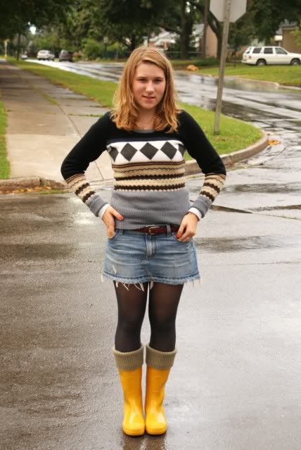
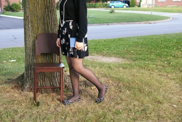
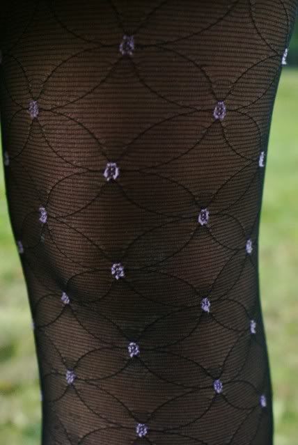
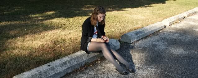
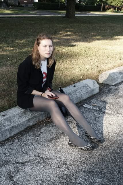
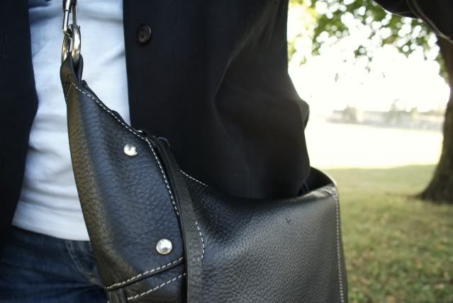
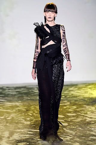
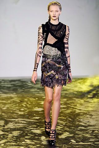
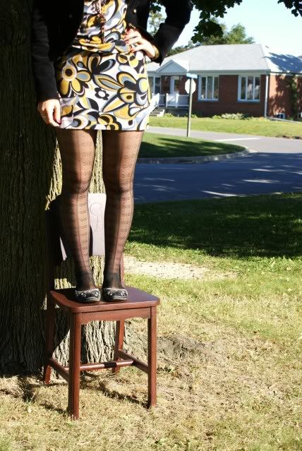
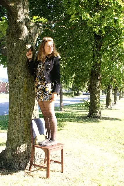
Why shoot in RAW? Well, here's an example of why. The original shot (the smaller, vertical shot) has all the color information found in the finished (developed) image. The first, and most obvious change from the original to the completed image is that it was cropped from a vertical to a horizontal representation of the scene. To make the absolute best image from the shot there "should have been" a horizontal to start with. But, there wasn't, so cropping was needed. The second thing that's highly noticeable is that the negative was flipped. It used to be slightly trickier in the film days because you had the side of the film with the actual image on the opposite side as it should have been. It resulted in a minute degradation in image quality, but typically not enough to notice. I think it was more psychological on the part of the photographer than it was physical to the viewer. Today, "flipping the negative" is simply a matter of moving ones and zeros. No loss of quality. To join the discussion of printing images right out of the camera versus developing an image, hit the "read more".

Anyone who thinks they should "get it right in the camera" to a printable condition shouldn't be shooting in a RAW format. If you want to pop the memory card out of the camera and plug it into a printer, shoot in Fine JPEG. You do want to be able to make the best quality available to you, and you can always reduce the quality to get something for a 4 x 6 print of for the web. You just can't make a good, large print from a highly compressed file. The other thing to keep in mind is that a JPEG image is "developed" in the camera. Rather than making the development decisions on your own, you're allowing the camera to make a set of assumptions about "how" the picture should look. Don't get me wrong, the algorithms set by Nikon, or Canon, or Sony, or Fuji are pretty darn good. Each time I shoot a wedding I shoot in JPEG just to avoid needing to develop the images in Lightroom. It's a minor thing, but a time saver. Sorry, but the typical bride or bride's mother isn't going to know that the image quality isn't the absolute best it can be. They'll be thrilled that they have good a good wedding album.
.
You can read in a thousand posts on the web that RAW images are flat, they're not sharp, they lack punch and need to be worked. It's true. The camera serves as a recording device and takes in all the detail that hits the sensor. It's sort of like the ultimate unbiased reporter. There's a television news outlet that says "we give you the fact, you decide". Yea, right. There's a bias in there somewhere. The equivalent of a RAW file would be to air the raw footage of a news event. Once something is edited, someone's bias is introduced. Based on that theory, we apply our own biases to whatever image we develop. Some people do incredibly sensitive developing, coming up with very subtle tonal differences. My "editorializing" is more of a "hit you over the head" style. I don't think I've ever heard anyone say "how sensitive" or "how subtle" when referring to one of my finished images. That just doesn't happen.
.
Whatever your "style" is, RAW images need to be developed. It's the same in the dry darkroom as it was in the wet darkrooms of the past. The decisions make by the photographer are what determines the final image, not the camera.

rain rain come again

I'm becoming a very bad blogger, and that makes me very ashamed because I want to stay on top of things, but it's really hard to blog along with school. I think it's more the picture taking that I can't seem to fit into my schedule, although I think it will get better soon once I learn to properly manage my time in university. These past couple of weeks have been hectic, what with enormous amounts of readings, my social life, plus trying to get involved in many extra curricular activities. Plus I need to fit sleep into the picture as well.
Anyways, today was a rainy day, so I took out my yellow wellies. I love rainy autumn weather, it's my favourite time of the year. I love wearing big wooly sweaters, tights, raincoats and most of all I love sitting in cafe's drinking coffee with friends while looking out at the rain falling outside. It makes me positively squeal with glee.

sweater, Point Zero. skirt, Hollister. tights, unknown. jewelry, gifts/vintage. nails, Loreal. wellingtons, Cougar.


It's Not HDR, It's EDR

Scott Kelby had a post about EDR (Extended Dynamic Range) developing of images, so I figured I'd try it. His interpretation of "where" to use this technique was more toward the portrait end of photography. Me? Being willing to push anything in different directions, I figured I'd try it on a landscape image and see where it would go. Let me know what you think, but I sort of like it. It gives an HDR (High Dynamic Range) feel to the final image, but doesn't use any of the HDR software that's available. No Photomatix, no Photoshop HDR blend, no Qtpfsgui, or Picturenaut 3, just either Lightroom or ACR (Adobe Camera Raw). One of the best things about this technique is that it's "real time" and just a couple of slider movements. First thing that happens is you make your image look really crappy and then, with one more slider, it comes to life. To find out more about the technique, and how easy it actually is, hit the "read more".


This is going to be quick. Another of those things I've explained that takes longer to read about than to do. Open the image in either Lightroom's Develop Module or the ACR module of Adobe Photoshop or Photoshop Elements. Both have the same basic programming, with LR having the advantage for cataloging and output. ACR has no cataloging or output functions. The only way to get something out of ACR is to bring it to another program (about any other program that will read the ACR raw format). The controls are all the same between the two programs, with only different placement of where you find a particular control.
.
Take the Recovery slider and bring it to 100%. Same with the Fill Light slider. Move the Clarity and Vibrance sliders to about +50. The image will now look pretty washed out. The magic happens when you start taking the Blacks slider up. You'll see the richness return to the image. For a landscape you can play around with the Contrast slider if you wish. The Blacks and Contrast sliders are like salt and pepper. Use both "to taste".
.
Once you have the image looking the way you like, bring it into Photoshop or Photoshop Elements and go through your normal workflow. In my case I use every step I've outlined in earlier posts. One way to think of this technique is like doing any prep work for developing your image. Just as you would do any dust removal, or blemish correction, or whatever you do before you start developing your image, this is a way to get an image "to" a starting point.
.

It's The Hap, Hap, Happiest Time Of The Year

It's late September. The time of the year when photographers go crazy. I'm sure the road to the "Jenny Farm" will be mobbed during the next couple of weekends with hordes of shutter clicking shooters hoping to prove the definitive shot is still within their camera. They'll put their tripod right next to the other hundred photographers on the road and think they have the magic formula to "get it right". Chances are good, no chances are extreme that they will get a shot that looks pretty much like the one the person standing there last year, or yesterday or tomorrow will get. There will be days with better skys and overcast days when the colors explode, but the farm is the farm is the farm. Do a Google image search on Jenny Farm and you'll see that most of the shots are basically the same. Up the road, down the road, with the tree included, without the tree in the shot, but the same old, same old. Today's image is not of the Jenny Farm or of any of the iconic shots of northern New England. To find out a little more about the shot, hit the "read more".

Today's image was taken at a highway overlook in the White Mountains. Exactly where? I don't know. (Another case for geo-tagging.) Too many photographers zoom past a hundred opportunities for a unique shot of some of New England's fall color to get to the iconic shot that "everyone" has shot. It certainly doesn't hurt to ask, Google or read about area you'll be traveling to for photography. I've definitely been an advocate of shooting close to home, but I do have to say, if you're going to be in a "target rich environment" like New England in the foliage season, there's nothing wrong with getting lost. Specially today, with "almost" everybody having a GPS unit in the car to get you "unlost".
.
Fall in New England is the one time of the year when I do recommend driving aimlessly around. I've stumbled across some of the nicest scene and vistas I've ever shot by driving down some nameless road and slamming on the braking. Another benefit of rural back roads is that you're not likely to cause an accident by "slamming on the brakes". We've found barns and fields, fences and stonewalls, trees ablaze with color and leaves piled up along the sides of roads (dirt and paved) and all sort of other things on "the roads less traveled".
.
If you happen to live along the New York, Connecticut border, go find Route 22. It runs due north just inside the New York side of the border. Don't bother with Route 22. Less than a half mile to the east is a road that runs parallel to Route 22. That's the one to take. It goes past farms that rival those you find in Hew Hampshire and Vermont. A couple of places crest a hill and down the flank is a quintessential "Jenny Farm" type scene. The farm is in the dale, the tress beyond are on fire with color and the foreground trees provide a great frame. Another area on that road is a tunnel of maple trees with a distance view down the road. Either wait for a car to pass or have your companions walk up and down the road ("costumes don't hurt) to get some human interest shots.
.
Whatever you do, get lost, get found, use Dave Middleton's book, use a GPS or visit Jenny Farm, get out and shoot. This is the season in the northeast.

book/worm

My second week of university is over, and so far I'm still loving it. Everything about university is so completely amazing that I cannot put into words how happy I am that I am finally at this point in my life.
As I mentioned before, my University is split into little colleges that act as your home base. Sort of like the houses in Harry Potter. Anyways, every year, each of the colleges has their own book sale, and my college always has theirs first. So today when it opened I went with one of my very good friends where we spent a good hour looking through various books. I ended up buying a lot of books, so many in fact that I had to put them all in a huge box which I then had to lug on the subway during rush hour on my way home. The little blue book I'm holding in my pictures is one of the books I bought.
I also happened to run into the lovely Elizabeth from Chic Heroin today. I knew she went to my university, but I never expected to run into her because the campus is so big. Yet today I did. It was completely random, and weird (in a good way) because you never expect to see another blogger in a real life. It was rather exciting though because I've never met any other bloggers before.

I'm off to go do some reading now. Have a good day everybody!

Ps. The random chair is still there in the park. I'm in half the mind to take it home with me. It is a rather nice chair.

shirt, American Apparel. skirt, thrifted/DIY. tights, Winners. shoes, Aldo. necklaces, gifts.


smell of wine and cheap perfume

I had a wonderful day today. It was just one of those days where everything falls into place, and is exactly how it should be. One of my favourite parts was getting caught in a light shower while browsing various clothing shops after my class. I had to take cover in the shops to avoid the rain and in the process I discovered an underground shopping mall filled with the most marvelous stores. I'd always known about this mall, but I never had any idea that it extended so far underneath downtown Toronto.
Anyways, this outfit is probably one of my favourites so far. It's most likely due to the fact that it's not what I usually tend to wear, what with the shorts and all, but it contains many of my favourite things such as tights, the colour red, and rolled up sleeves. I don't wear pants much and I never wear shorts in public (without tights), so this outfit is quite the compromise. Shorts and tights is one of my favourite things to wear, especially when I'm having an off day. It's comfy, looks unique, and still allows me to create a good outfit.
Tomorrow will be the end of my second week of university. It feels like it's all going by so much quicker now. I can't believe that soon it'll be a month of school gone.

Hope you're all having an amazing day!
Ps. I am so in love with the song "Don't Stop Believing by Journey". I think I've used lyrics from that song as blog titles way too many times.

suede jacket/shirt, thrifted. tee, DIY. tights, unknown. shoes, Aldo. shorts, American Eagle. bag, unknown. bracelet, Honey. cell phone, LG Rumour.


Paying Homage to Bert

Every once in a while you find something that reminds you of something you've seen or have been touched by. Today's image is along those lines. We were out shooting in Rockport Massachusetts, walking up Bear Skin Neck and came across this display. I like the simple composition and the repeating colors in each piece. There's "enough" detail in the tops of each shaker and the cruet. The tops are all metal and should be very reflective. The slide on the cruet provides interest and keeps the lid from being just a big blank spot in the image. The colored shadows give some depth and bring attention to the textured mat. Each time I flip through the set from this trip I find myself pausing for a step at this shot. This is, obviously, a photograph. There's an artist out there who routinely makes photo realistic scenes with much more detail than you see here. To find out a little about him, hit the "read more".

If you haven't checked out Bert Monroy's work, you're really missing something. You've probably seen Bert's work on magazine covers or in some clever piece of advertising, but, he also does fine art, electronically produced pieces. The inspiration for today's image is Bert's piece, "Lunch at Tiburon". It has several of the same elements, like the shakers, a table covering and the reflections. The one big difference is that the gallery's image is a photograph and Bert's comes from his imagination. No part of the piece was there before Bert put stylus to electronic "paper". (Bert works on a Wacom Cintiq interactive pen display.) If you do a side by side comparison of today's image versus Bert's art piece you'll be amazed how photo realistic his image is.
.
While you're on Bert's site, check out every piece there. Each demonstrates what can be done in Adobe's CS4 Suite (and before). You can also find tutorials by Bert over on the Revision 3 website, under the heading of "Pixel Perfect". The ease that Bert has with Photoshop and Illustrator is shown in each episode. Things that would take hours for someone at my level are done by Bert in minutes. He routinely demonstrates the limitless possibilities available with the Adobe applications.
.
One thing to keep in mind as you look at Bert's work is that he is unencumbered by any "depth of field" limitations we find using cameras to create out images. Do a Google search on Bert and find out how he's coming on his latest work, a panorama of Times Square in New York City. Take a look at what the finished size will be. You'll be astonished.

look up

What a long and exhausting day. Although I'm only in my second week of university, I'm consuming way too much coffee late at night, eating random combinations of food due to the inability to think straight from my exhaustion (pickles and cheese) I've traded my gorgeous book bag/laptop bag for my old backpack due to the immense load of books I need to carry, I keep getting on the wrong subway trains on my way home meaning I spend an even longer time on the commute, and I've got way too much reading. Yet, this just adds to my love of university life. I love everything about university so far; the ivy covered buildings, the hours wasted between classes studying or spending time with my new friends, taking notes during lectures and even the exhaustion. Even though I might change my mind about how I feel as the weeks progress, at the moment, I love it all. I'm so happy that I'm able to have this opportunity to go to university, and learn and experience new things. These past couple of weeks have been completely live changing in a good way.

This was my outfit today. I took the pictures when I got home at 9PM so please ignore my facial expressions.


shirt, Guess. cardigan, French Connection. tights, unknown. skirt, DIY. belt, vintage. necklace, gift.


Oh, The Dreaded Highlight Blowout

Seems like everywhere you read you see pundits saying you have to preserve the highlights. I'll go along with that to a point. Those more knowledgeable than the self proclaimed authorities get it right. Saying you have to maintain the highlights is sort of like several other bastardizations of semi-well known quotes or phrases. On the early morning news program on ABC over the weekend the male host said the "computers get twice as fast and cost half as much every two years". The only part of that statement he got right was the part about "two years", and that's a modification of the original statement by Gordon Moore. Before Gordon got together with Bob Noyce to found Intel he was quoted as saying 'transistor density doubles every eighteen months (later modified to two years) with no increase in cost'. Computers get more capable, but not twice as fast. Things tend to get altered with use. Have you ever heard anyone say he(she) doesn't "cut the mustard"? Now, just how hard can that be? Mustard is typically a cream condiment. There's not much to cut. The actual term would be he(she) doesn't "cut muster". Muster, in this context, refers to a gathering of a military group for the purpose of inspection. If someone misses a muster, or fails a muster (doesn't pass the inspection) he/she might wind up in some serious trouble. The same alteration of the idea of not blowing out highlights is today topic. To find out if today's image has blown out highlights, hit the "read more".

The easy answer is yes, it does have some blown out highlights. Just not as many as you might think. You'll have to sort of take my word for it because I'm looking at the full sized image while you're looking at a "for the web" version. There's three distinct spots that have blown out pixels (pixels that register at 255, 255, 255). One is in the vertical line just below the glass in the lighthouse. There are eight pixels in that line with no detail. Another area is just beside the upper windows in the front of the house. That one has thirty six empty pixels. I blew the original image up to pixels level and counted them. The third area is on the right arch above the porch and has about six offending pixels. The image is as shot as far as cropping goes, so we have a twelve megapixel image with fewer than fifty pixels blown out. That's got to be a pretty good ratio.
.
The thing about not blowing out the highlights that some of the pontificators seem to miss is that they have to be "important" pixels. On the lighthouse, the glint is supposed to be white. If eight pixels go over the edge and have zero detail, oh well. You would need scientific instruments to be able to figure out which pixels have detail and which do not. I'm a lot more interested in looking at an image than I am doing a forensic analysis of it.
.
There's a saying, "all things in moderation". There has to be a limit on what the boundaries are in the images we look at. Is today's image a great shot? I've seen better, but it's one of the best I took at the time we were there. We'll be back up on the Maine coast in a couple of weeks. I don't know if we'll shoot Portland Head Light on this trip or not. Hopefully there will be some good skys wherever we shoot and we'll get a few decent shots. What we get will be what we print, that's about all you can do. If you're there on a good day, it's up to your skill to get a good shot. If you're there on a crappy day, aim your camera lower or at smaller details. There will still be good shots, just not the sweeping panoramas.

contemplation

I haven't looked through many of the Spring 2010 collections so far but from the ones I have seen, I have positively fallen in love with Rodarte. It's completely different from anything that I would ever think of wearing, but compared with all the other collections, this is the one collection where I would want to see everything in my closet. The beauty of the clothing simply stuns me. When I look at the clothes I'm not even sure what I'm looking at, for to me it looks more like a piece of art than an article of clothing.

What do you all think?


the empty chair

Today was an amazing day. I finally got to sleep in which I definitely needed. I spent the rest of the day studying which was actually nice until I got to my economics reading. There really is too much to read. Anyways, in the evening I went out with some of my very very awesome friends to dinner followed by browsing random stores in the mall and taking lots of pictures. It was a great way to unwind from the hectic week, and just enjoy the company of people who are truly lovely.
On other news, my birthday is coming up in about 2 weeks and it's really exciting. I can't believe that I will be 18, it's just so weird to think about it. I still have no idea what I'm doing or what I will wear. Although it is my 18th, I don't want to do anything big, I'd rather just have something small with a couple close friends.

Hope you all had an amazing day!!

Ps. I saw this chair in the park today and I knew that I simply had to take my outfit photos with it.

dress, BCBG. jacket, Marciano. shoes, Aldo. tights, Winners. jewelry, random/gifts/vintage.